Men's shorts style image
Updated on
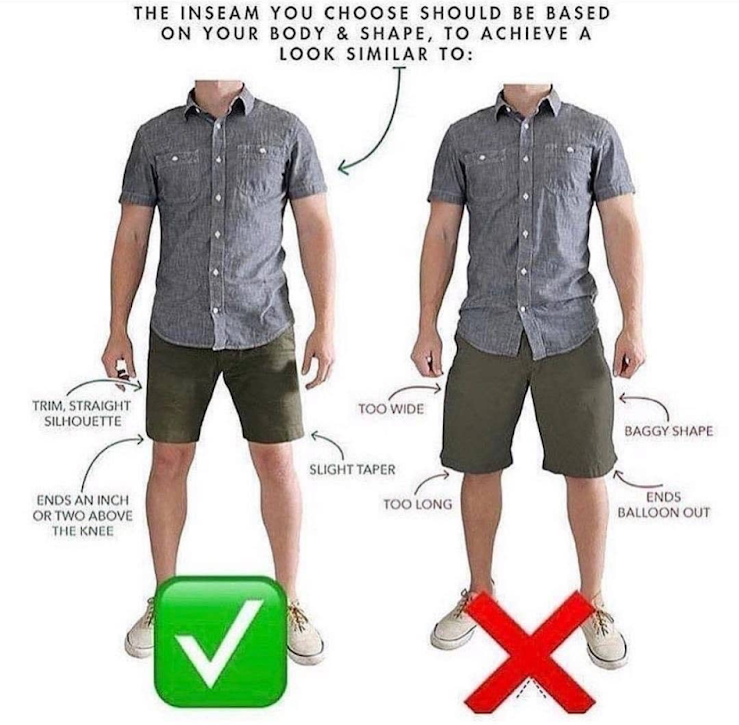
This image nails visual teaching. It shows two guys wearing similar outfits but instantly makes one look cooler and more put-together. And it does it all with arrows, labels, and a giant green check.
Why this hits hard
- Shows contrast: right vs wrong, side-by-side.
- Arrows and labels make it brain-dead simple to follow.
- Solves a tiny but relatable problem (how shorts should fit).
- Uses clear visual hierarchy to guide the eye.
- The check and X trigger instant recognition and clarity.
Real-life uses
- Fitness brands showing correct vs incorrect form.
- UX designers showing bad vs good layouts in pitches.
- Shoe companies showing the right way to lace running shoes.
- Email marketers comparing cluttered vs clean email layouts.
Clear visuals + contrast = instant understanding.
Analyzed by Swipebot
Loading analysis...
