Michi Ramen Home Page

Michi Ramen nails what every restaurant site should do: make it insanely easy to eat. You land on the page and instantly see what you need—beautiful food, clear menu, and a big fat “Order Online” button. No scrolling confusion, no mystery links.
Marketing Breakdown
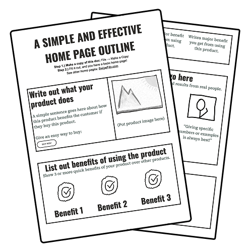
The layout works like a perfect service flow:
- Show the product (mouthwatering ramen photo).
- Explain the process (simple “How to Order” graphic).
- Show options (menu on the same page).
- End with a low-friction call-to-action (Order button).
Why It Works
- Visual hierarchy guides your next step.
- Emotional hook: the food photo sells the craving.
- One-page simplicity removes friction.
- Direct CTAs shorten decision-making time.
- Clear info builds trust and speeds conversion.
Real-World Examples
- Chipotle’s site works similarly: visual menu + “Start Order” above the fold.
- Sweetgreen’s homepage = healthy food shot + quick order buttons.
- Shake Shack keeps CTA visible at all times.


