NASA Wiring Workmanship Standards Image
Updated on
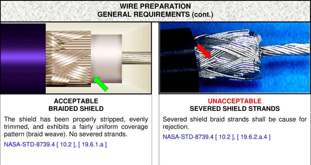
NASA’s workmanship manual is wildly satisfying to look at. One glance and you instantly know what’s right and what’s wrong. No fluff. No confusion. Just red and green arrows, side-by-side photos, and plain-text explanations.
Why It Works
- Uses visual contrast to teach judgment instantly.
- Puts good vs bad examples side-by-side for faster learning.
- Keeps language simple and action-focused.
- People understand in seconds, not minutes.
Real-World Examples
- Apple shows side-by-side “before/after” photos in camera ads.
- Grammarly highlights errors in red and fixes in green.
- IKEA manuals teach complex builds using only pictures.
- Google’s UX design pages show “do/don’t” layouts with color contrasts.
Clarity sells. When your message is this obvious, people can’t help but get it.
Analyzed by Swipebot
Loading analysis...