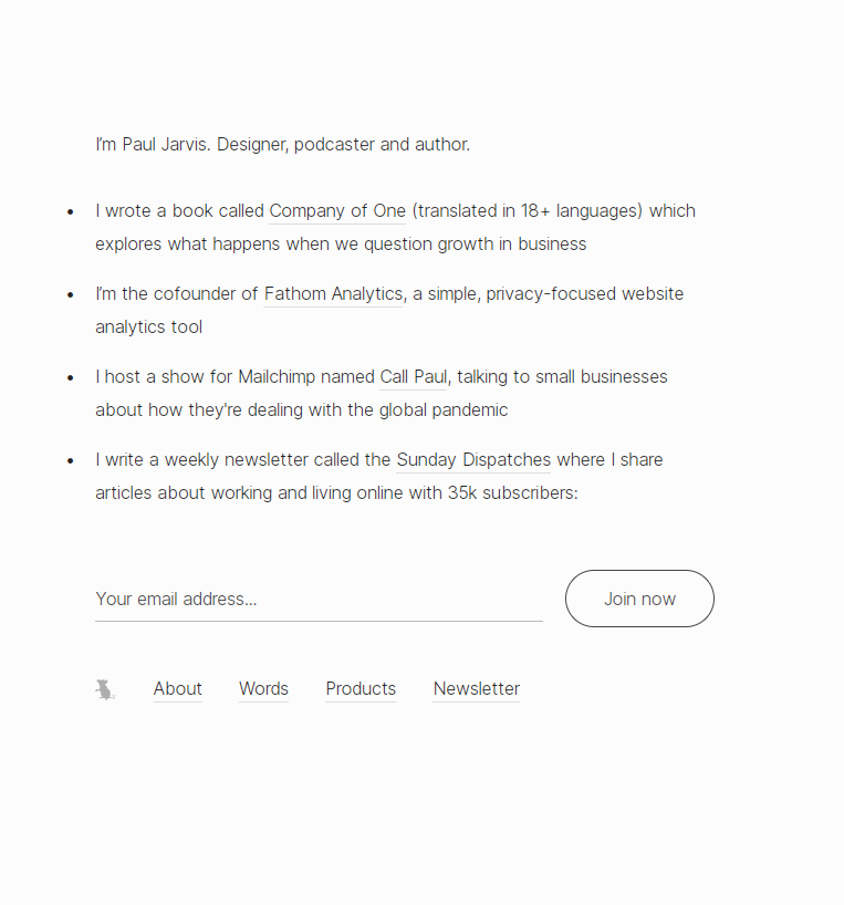
PJRVS Minimalist Home Page

Paul Jarvis proves you don’t need flashing buttons or funnels that scream “BUY NOW.” His homepage is just 86 words and an email signup—and it works beautifully. It’s simple, confident, and built on trust.
Why this page nails it
- Leads with a personal intro—people connect with people
- Lists “big wins” like book translations and brand collabs for instant credibility
- Shows real social proof (35k subscribers)
- Keeps the call-to-action chill: “Join now”
- Offers links for those who aren’t ready to commit
Real-world echoes
- Basecamp’s founders wrote It Doesn’t Have to Be Crazy at Work around the same ethos
- Seth Godin’s minimalist blog and newsletter follow a similar simplicity-first design
- Fathom Analytics’ site adopts this same “no fluff, just value” vibe
Analyzed by Swipebot
Loading analysis...
