Instacart Invite Not Available Page
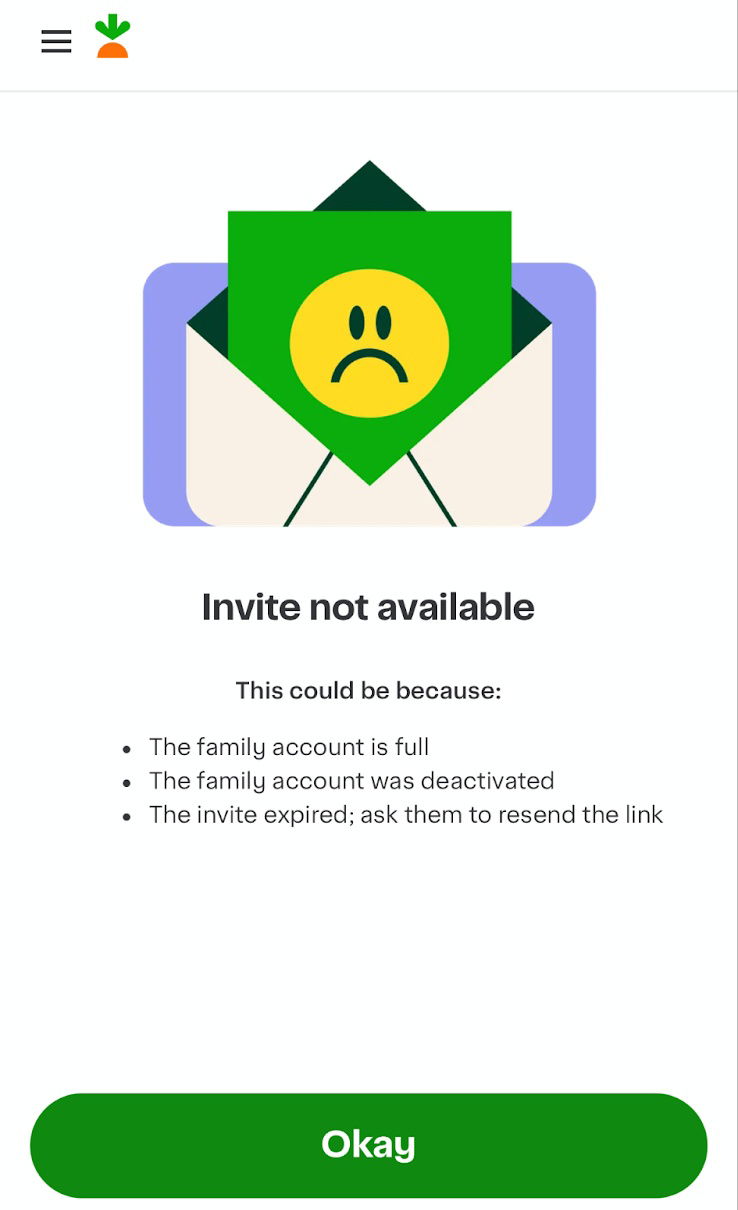
Nobody loves an error screen. But this one from Instacart feels… gentle. When your invite link expires, you’re greeted not with a scary red alert, but a sad little face and a clear explanation.
Why this design works
- Uses friendly visuals that lower frustration
- Lists clear reasons so users instantly understand
- Offers a next step (“ask them to resend”) instead of leaving users stuck
- Keeps copy short and calm — no tech jargon
- Design aligns with Instacart’s bright, friendly brand tone
Other brands doing it right
- Slack: Funny error screens like “Something’s gone a bit wrong” keep the mood light
- Airbnb: Gives clear options when listings expire
- Dropbox: Uses clean design and simple language for broken links
Good UX writing turns a dead end into a smooth detour.
Analyzed by Swipebot
Loading analysis...
