Planning out UI/UX with pen & paper
Updated on

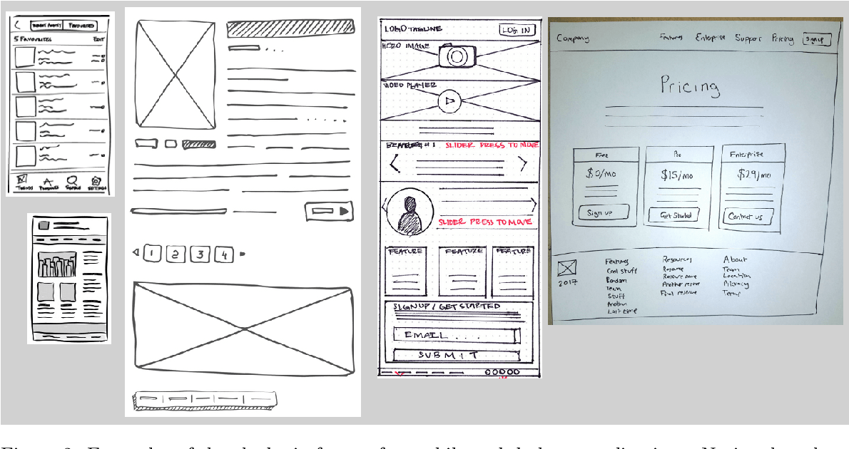
Designers love Figma, but sometimes the fastest way to fix a messy user flow is by grabbing a pen. These quick, hand-drawn wireframes show how speed and simplicity can outshine digital perfection. You don’t need plugins, templates, or pixel precision to think better.
Marketing analysis
Paper wireframes strip away distractions. You're not worrying about colors, icons, or grids—you’re solving problems. That rawness lets ideas flow faster, making it easier to iterate, compare, and test layouts before anyone touches a keyboard.
Why it works
- Low effort = more experimentation
- Forces clarity on structure, not style
- Encourages feedback early and cheaply
- Helps teams align visually fast
- Removes tool friction that kills momentum
Examples
- Airbnb’s founders sketched their early homepage before coding.
- Dropbox used rough layouts to pitch its MVP.
- Google Ventures’ Design Sprint starts every project with marker sketches.
- Mailchimp’s early redesigns began with whiteboard outlines, not wireframes.
Analyzed by Swipebot
Loading analysis...
