Pricing for SAAS urges annual pricing
Updated on
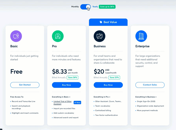
Otter.ai nails pricing psychology. Their pricing page isn’t just pretty—it’s a conversion machine. Notice how the toggle between “Monthly” and “Yearly” updates the prices instantly and highlights savings—but only when relevant.
Marketing Analysis
The “Save up to 36%” banner disappears when you switch to Monthly. That’s smart UX. It keeps the interface honest and highlights real value only when it applies.
The “Best Value” badge on the Business plan guides the eye exactly where they want you to click—social proof, visual hierarchy, and anchoring all rolled together.
Why It Works
- Anchoring makes the $20 plan feel cheap next to “Enterprise”
- “Best Value” badge reduces decision friction
- Real-time toggle builds trust
- Visual contrast guides the buyer’s focus
Examples
- Spotify grays out unavailable deals when discount switches
- Notion highlights its “Plus” plan as “Most popular”
- Dropbox shows annual savings right next to the toggle for FOMO fuel
Analyzed by Swipebot
Loading analysis...
