3 Tiered Pricing Mockup with Seat Selector
Updated on
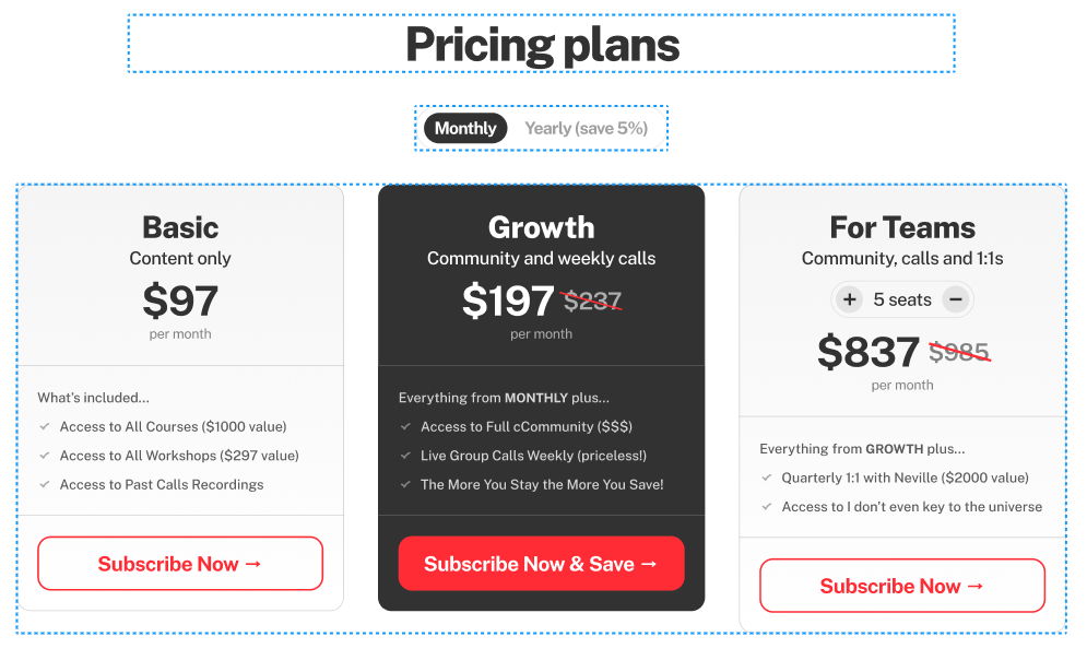
This 3-tier pricing layout nails what every SaaS or membership site should aim for: clarity, contrast, and control. It’s not just pretty—it helps customers decide faster.
Smart Pricing Design Tricks
The Basic, Growth, and For Teams tiers each hit a different buyer mindset: budget, value-seeker, and power-user. The interactive seat selector in the Teams plan? Genius. It instantly shows pricing updates, keeping buyers engaged and reducing guesswork.
Why It Works
- Each tier speaks to a different stage of customer growth
- Visual hierarchy draws the eye to the middle (the “best value” plan)
- Seat selector adds interactivity and transparency
- Simple language shows value without confusion
Real-World Examples
- Figma adjusts seats dynamically and shows cost per team member
- Notion’s “Team” vs “Enterprise” pricing focuses on collaborative power
- Slack highlights savings for yearly billing upfront
- ConvertKit uses stronger contrast on its mid-tier “Creator Pro” plan to boost conversions
Analyzed by Swipebot
Loading analysis...
