Reforge membership landing page:
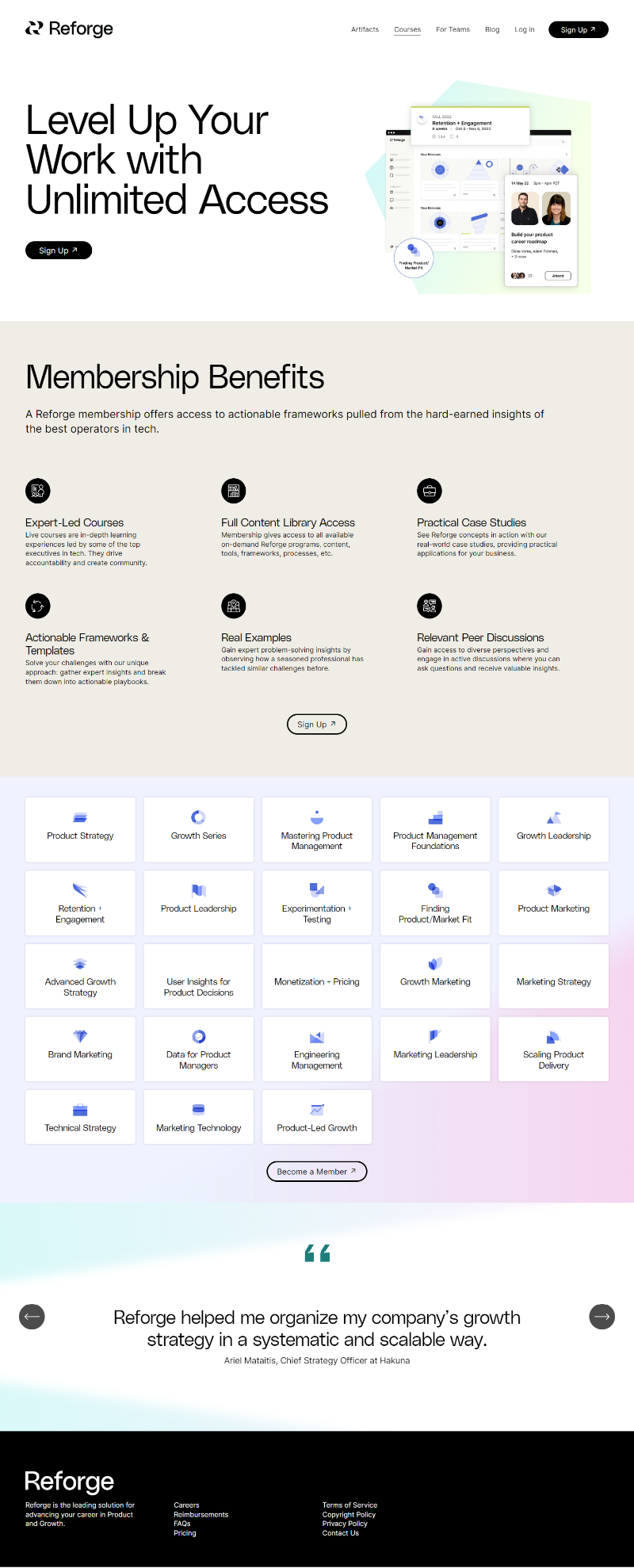
Reforge’s membership page nails the art of making “a ton of stuff” feel simple and valuable. Instead of dumping content, they package access around outcomes—growth, frameworks, and expert insights.
The Marketing Breakdown
Everything centers on clarity and credibility. The design is clean, the hierarchy tight, and every benefit ties back to “leveling up your work.” The icons, testimonials, and call-to-action buttons guide you through curiosity → clarity → conversion.
Why It Works
- Clear payoff headline (“Level Up Your Work”)
- Benefit-driven bullets that feel tangible
- Logical visual flow—top → benefits → programs → testimonial
- Social proof from recognizable experts
- Repeated CTAs that never feel pushy
Examples
- MasterClass: sells “access to experts” using similar icon grids
- HubSpot Academy: uses clean benefit breakdowns to show depth, not confusion
- Notion Pro plans: emphasize simplicity and access to unlock productivity
Analyzed by Swipebot
Loading analysis...
.png?width=3840&quality=80)