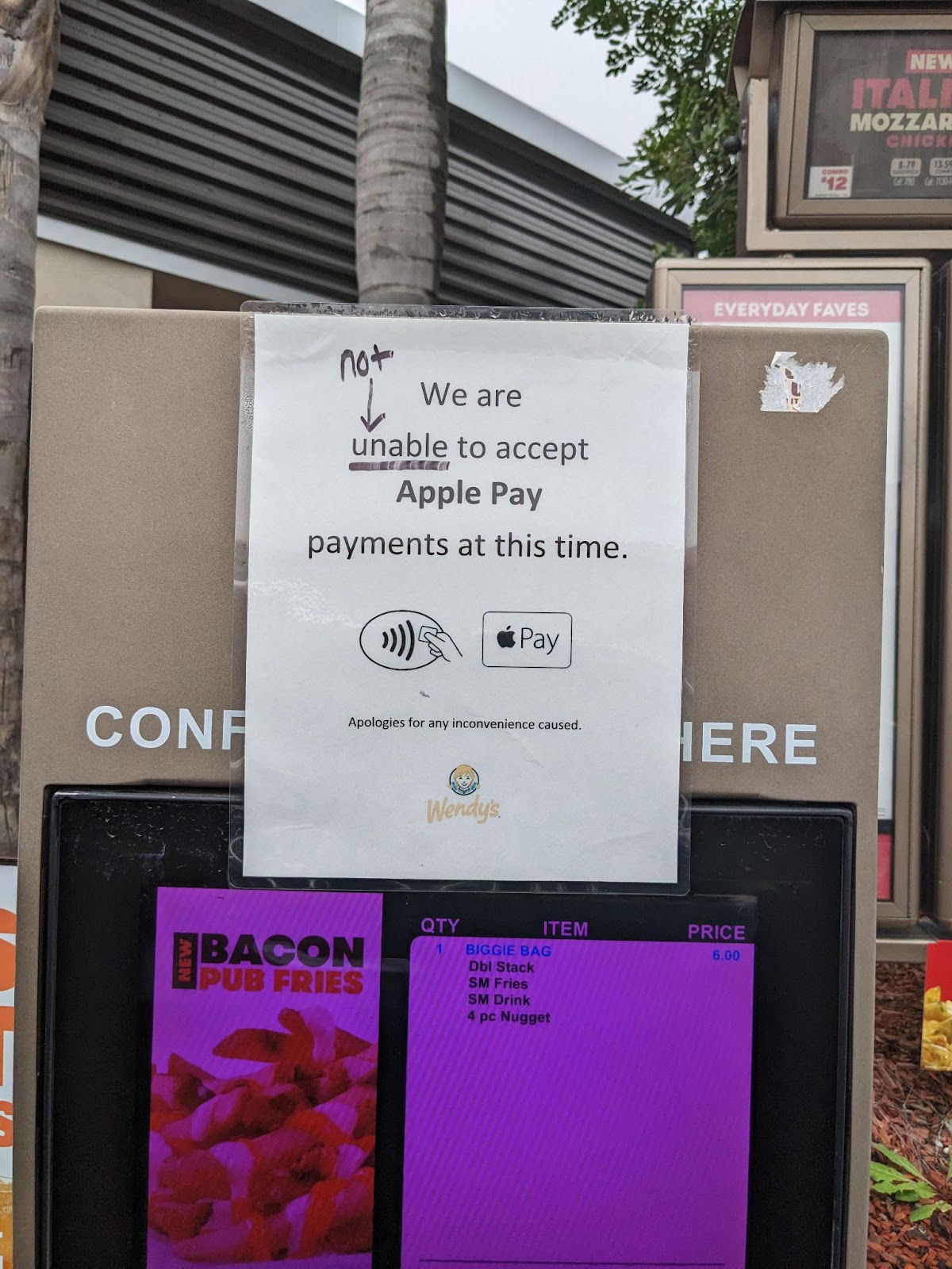
Rouge grammar vigilante simplifies a sign

Someone edited a Wendy’s sign that said “We are unable to accept Apple Pay at this time” by crossing out “unable to” and replacing it with “do not.” Suddenly, the message is faster to read and easier to understand.
The Power of Simpler Words
Short words hit faster. Long phrases like “unable to accept” sound stiff and bureaucratic. “Do not accept” says the same thing, but human.
Why It Works
- Cuts mental load for readers
- Sounds more conversational
- Reduces reading time by half
- Makes the brand feel friendlier
Real-World Examples
- Southwest Airlines: “Bags fly free” instead of “We do not charge additional fees for checked luggage.”
- Apple: “Think different” instead of “Encouraging individual creativity.”
- Nike: “Just do it” instead of “Go out and achieve your goals.”
Analyzed by Swipebot
Loading analysis...
