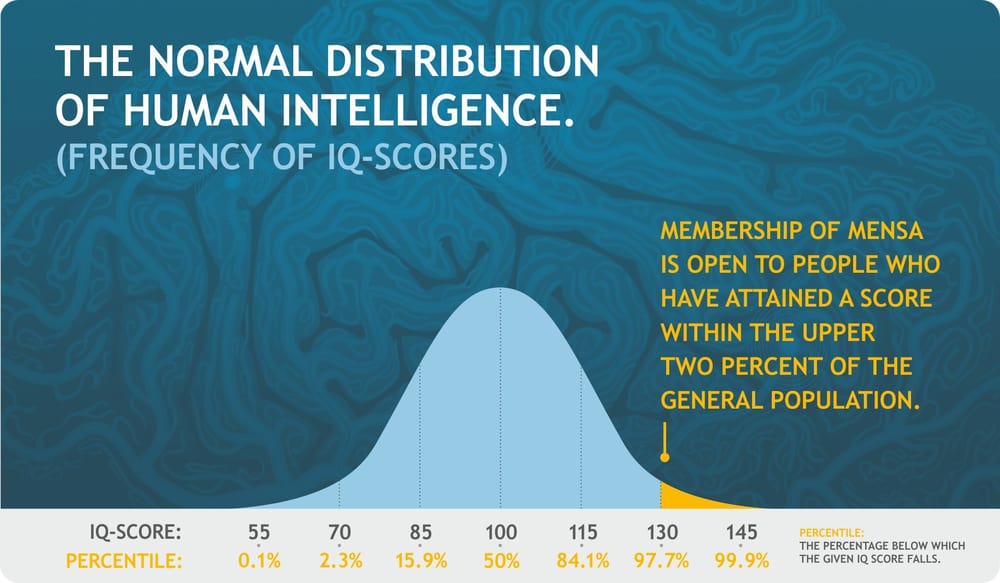
This chart nails one thing: exclusivity sells. Mensa doesn’t promise fun or networking. It promises you’re part of the smartest 2% of people on Earth.
Why It Works
- Scarcity: Only 2% of people can qualify. That automatically makes it desirable.
- Status signaling: Membership becomes proof of high intelligence.
- Clarity: The chart visually explains exactly where you need to be to join.
- Identity marketing: It appeals to people who see themselves as exceptional.
Real-World Examples
- Rolex: Limited production creates long waiting lists and status appeal.
- Tesla’s early model owners: Seen as tech elites before EVs were mainstream.
- Soho House: Membership by approval only keeps it aspirational.
- Harvard: Low acceptance rate fuels brand prestige.
Analyzed by Swipebot
Loading analysis...
