Tesla Powerwall Sales Page
Updated on
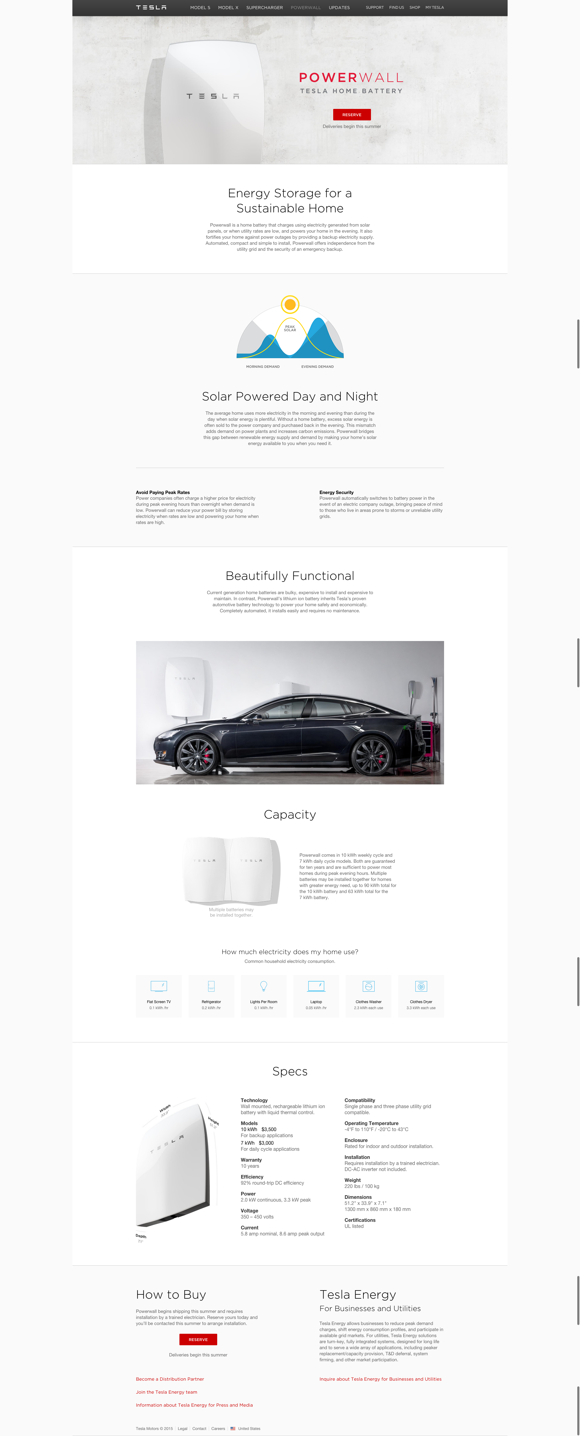
Most battery ads look like they belong in a garage. Tesla’s Powerwall page looks like it belongs in an art gallery. The layout feels clean, futuristic, and totally in sync with Tesla’s luxury image.
The Marketing Behind the Design
Every inch of the page whispers class and calm. White space everywhere. Smooth visuals. No complex specs upfront—just benefits like savings and independence. Even the CTA button is chill: “Reserve.” No pressure, just confidence.
Why It Works
- Minimal design makes it feel premium
- Lifestyle first, technology second
- Gentle CTA fits the upscale tone
- Visual story keeps you scrolling
- Clean layout builds instant trust
Examples
- Apple sells lifestyle by stripping away clutter
- Dyson markets beauty before suction power
- Peloton features energy, not exercise stats
- Nest shows design harmony with minimal text
Analyzed by Swipebot
Loading analysis...
