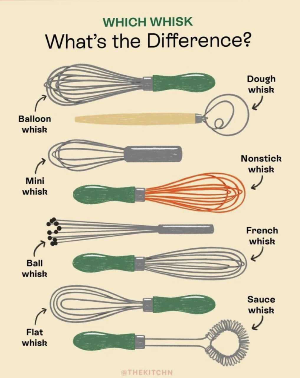
This image nails what great marketing design should do: make something complex instantly clear. A dozen types of whisks, one clean graphic, zero confusion.
Why This Visual Works
- Clarity first: Each item is labeled and visually distinct—no guessing.
- Useful context: Shows differences and explains purpose.
- Consistent design: Unified layout keeps it simple, not cluttered.
- Visual variety: Enough contrast to keep attention, enough similarity to make sense.
Real-World Examples
- Apple: Compares iPhones side-by-side so buyers instantly see the best fit.
- Headspace: Illustrates meditation techniques clearly with cute characters.
- Warby Parker: Side-by-side glasses try-on tools show subtle style differences fast.
Analyzed by Swipebot
Loading analysis...
