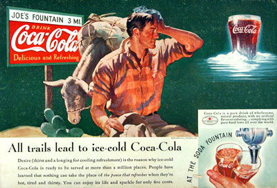
Even without animations or bright screens, Coca-Cola nailed visual storytelling back in 1935. This print ad practically moves your eyes from the dry, dusty traveler to the tall, frosty glass of Coke.
Marketing analysis
Heatmaps show 69% of viewers first look at the red Coca-Cola logo, then the man’s orange shirt, then the icy drink. That’s good design — it controls the viewer’s gaze using nothing but color and contrast.
Why it works
- Red grabs attention instantly
- Warm-to-cool color contrast = built-in motion
- Your eyes follow the emotional story arc: hot traveler → cold Coke → satisfaction
Examples
- McDonald’s uses red + yellow to pull focus and build appetite
- Apple’s bright products on blank backgrounds direct eyes right to the goods
- Old Spice ads use visual flow to end every shot on the product payoff
Analyzed by Swipebot
Loading analysis...
