AI Wheel Chart
Updated on
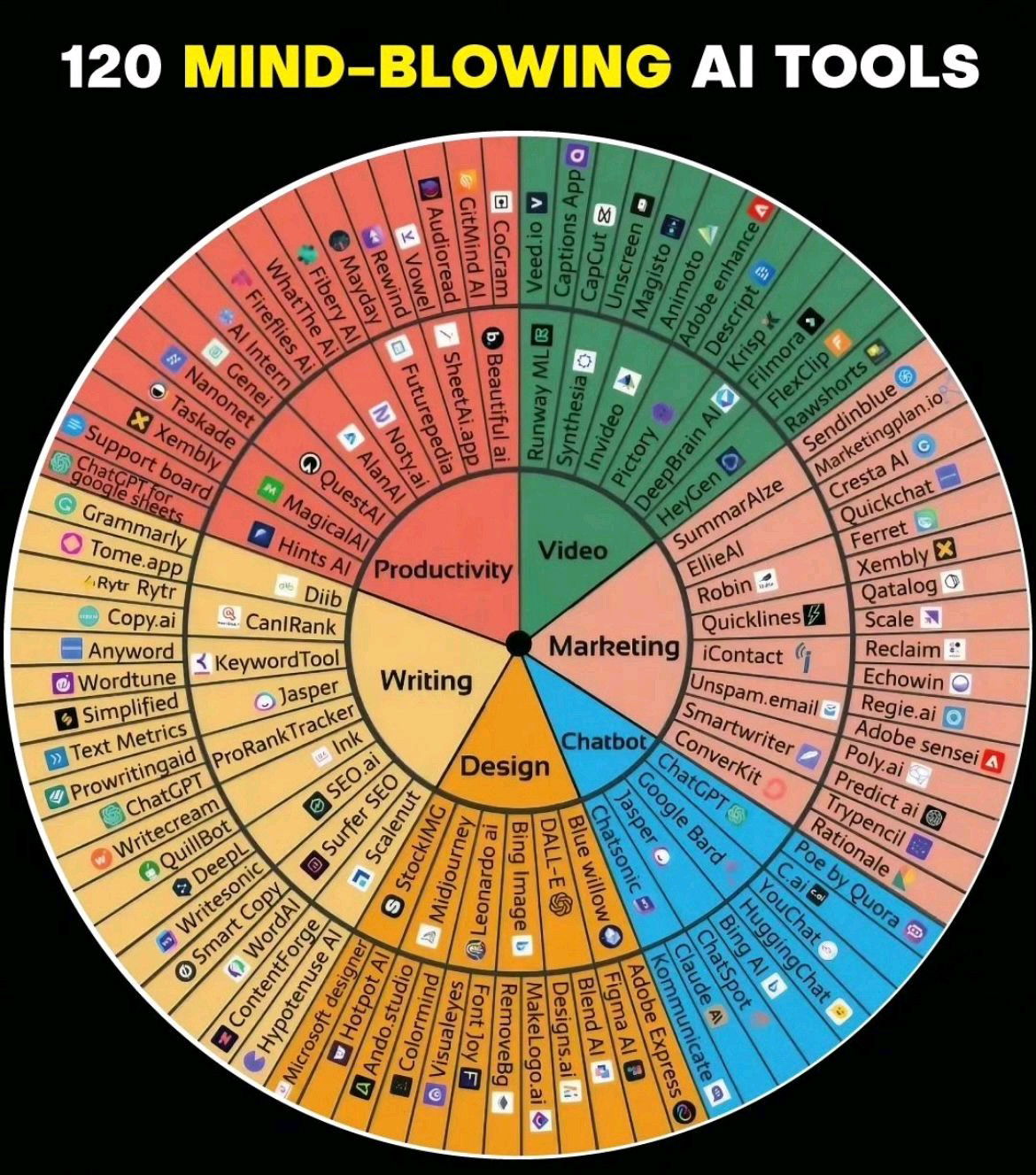
Someone took the “Feelings Wheel” (yes, the one from therapy offices) and remixed it into a wheel of 120 AI tools. Genius visual. It makes a chaotic topic (hundreds of new AI tools) instantly feel organized and usable.
Why This Visual Hits So Hard
- It taps into a familiar format — people already understand how to read the Feelings Wheel.
- It organizes complexity into clear categories (Writing, Design, Chatbots, etc.).
- It’s inherently shareable — colorful, circular, and loaded with info.
- It conveys authority fast: 120 labeled tools = expert-level effort.
Real-World Examples
- HubSpot’s “MarTech landscape” chart grouped 8,000+ tools and went viral.
- Gartner’s Magic Quadrant works for the same reason — visual authority.
- Canva’s weekly design trend wheels get high engagement on LinkedIn.
Analyzed by Swipebot
Loading analysis...