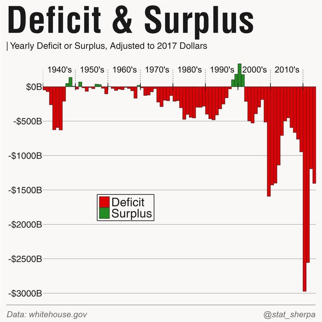
This chart is a visual punch to the gut. It shows U.S. yearly deficits and surpluses since the 1940s, and that dramatic cliff on the right? Yeah, that’s recent.
Marketing analysis
This image works because it tells a story instantly. No extra text needed. The use of red (deficit) dominates and triggers urgency, while the rare bursts of green (surplus) stand out like hope spots. The contrast and visual scale make the trend impossible to ignore.
Why it works
- Big visual contrast = emotional punch
- Simple color coding makes data instantly clear
- Long timeline shows patterns and context fast
- Shock factor draws attention and shares
Examples
- Spotify’s yearly revenue vs. profit charts create urgency around scaling strategy.
- Tesla’s early losses visualized in red bars built investor confidence in long-term vision.
- Charity: Water uses before/after funding visuals to make problems and impact obvious.
Analyzed by Swipebot
Loading analysis...
.png?width=3840&quality=80)