Anatomy of a Email Newsletter
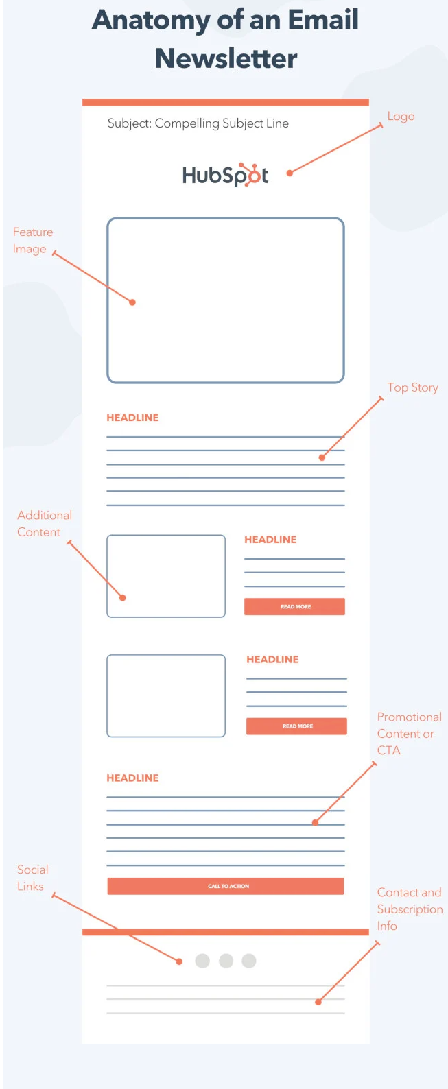
Most email newsletters fail because they try to do too much. HubSpot’s simple “Anatomy of an Email Newsletter” layout shows how to organize content in a way that makes people actually want to scroll.
Marketing Analysis
This layout nails the basics: a clear subject line, a headline-driven story flow, and smart use of visuals. Each section builds on the one before it, guiding the reader down to a single call-to-action. It’s content-first, sales-second—exactly what keeps engagement high.
Why It Works
- Familiar structure makes the layout easy to follow
- Scannable headlines keep attention moving
- One main CTA avoids distraction
- Visuals break up text and highlight key points
- Consistent branding builds trust
Examples
- Morning Brew uses the same “top story + quick bites” format to drive 4M+ subscribers
- TheSkimm formats each issue like a quick read—headlines first, links second
- Moz Top 10 uses one email layout for years, proving a consistent structure wins long-term
Analyzed by Swipebot
Loading analysis...
