The Anatomy of Great Newsletter Design
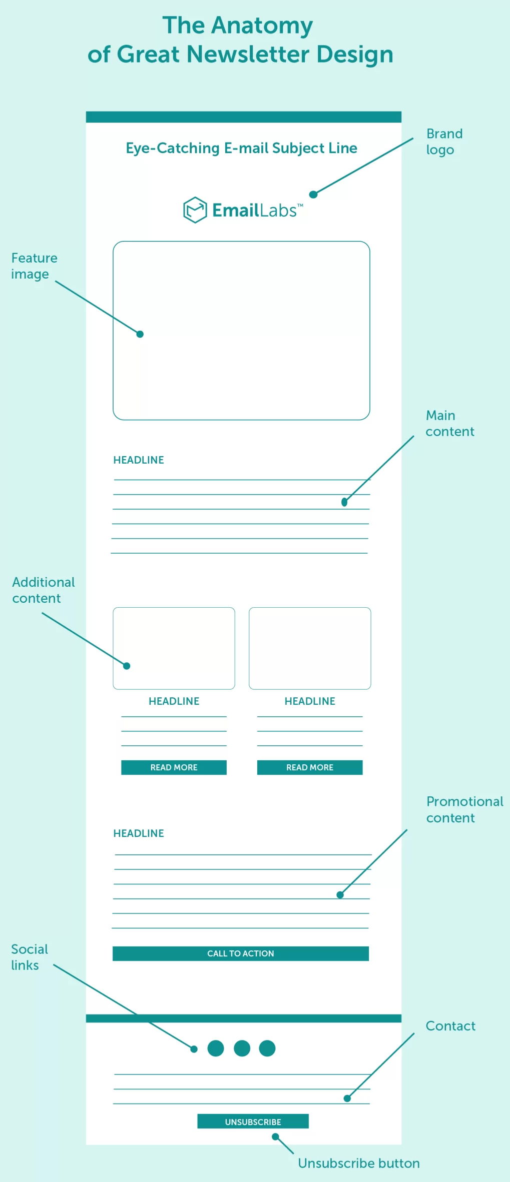
If your newsletter looks messy, readers bounce. This visual from EmailLabs shows a clean blueprint every marketer should steal: headline, feature image, bite-sized sections, and a clear call to action. It’s structured to guide the reader smoothly from open to click.
Why this layout works
- A bold subject line earns the open.
- A feature image grabs attention fast.
- Headlines and short text blocks make it skimmable.
- Clear CTAs turn readers into clickers.
- Social and unsubscribe links build trust and compliance.
Real-world examples
- Morning Brew keeps headlines snappy and CTAs minimal, hitting 7M+ subscribers.
- The Hustle uses humor upfront to boost open rates above 40%.
- Canva’s monthly digest leads with visuals and tutorials, driving product use.
- Headspace emails pair calm imagery with one simple “Try Now” button.
Analyzed by Swipebot
Loading analysis...
