
The format of this chart easily demonstrates how Apple’s 2022 revenue was the combined revenue of alllll these big tech companies 😬

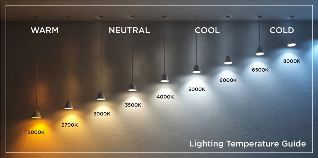
This is a very simple yet very cool guide that shows the difference between warm, neutral, cool, and cold lighting....
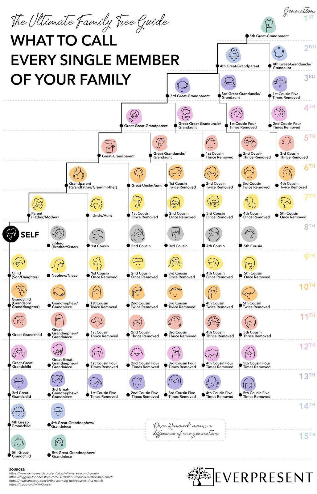
This colorful one-pager breaks down what to call every single family member—across 15 generations.
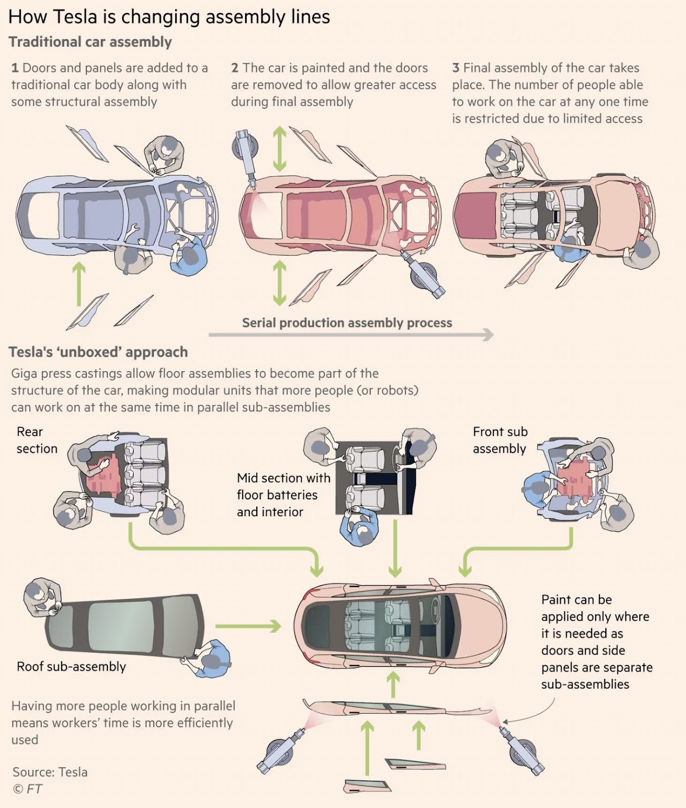
Illustrations showing difference between traditional assembly lines and Tesla "unboxed" approach.

Having a longterm goal is very important.If you don't, you might just do random things that add up to nothing...

This is a cool way to show the data of most popular grocery stores by state. Rather than a bar...

This treemap chart illustrates the proportions of chocolate exports from various regions around the world.
Search for a command to run...