Apple's Revenue Graph
Before and After
Aug 30, 2017
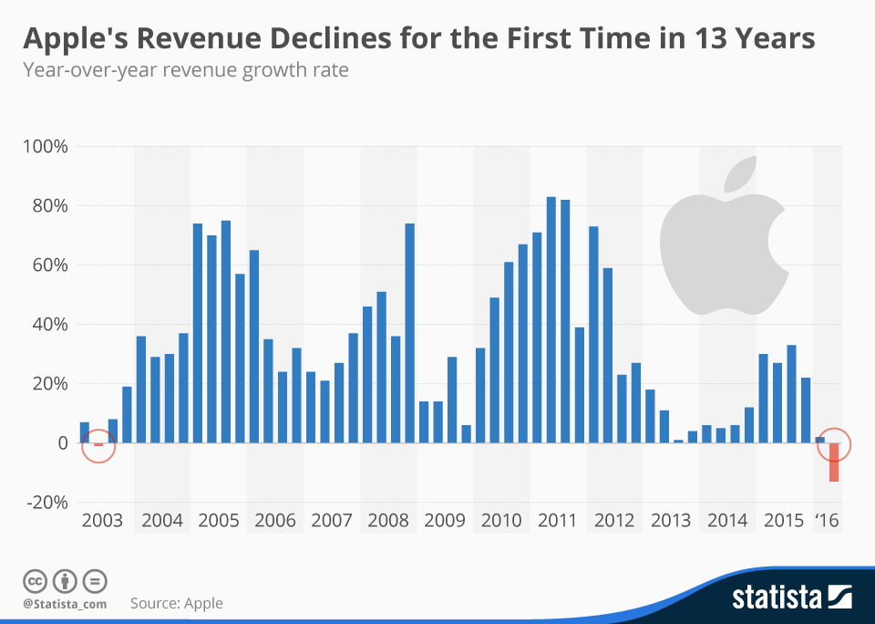
This graph was used to illustrate Apple's revenue decline after a 13-year streak.


This was a cool graphic showing Tropicana’s sales went DOWN after swapping their iconic orange-with-a-straw image for a plain glass...
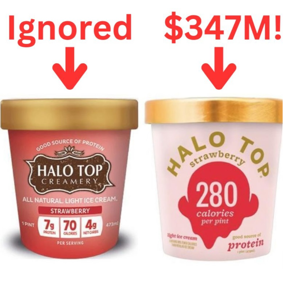
Halo Top ice cream led to annual sales totaling $347 million after they stopped promoting the brand as much, and...

This shows the difference between Waymo and Tesla cameras. It shows that Waymo has a lot more cameras (29), five...

By adding a couple of little hand drawings in here, it made this ad stand out way more and grab...
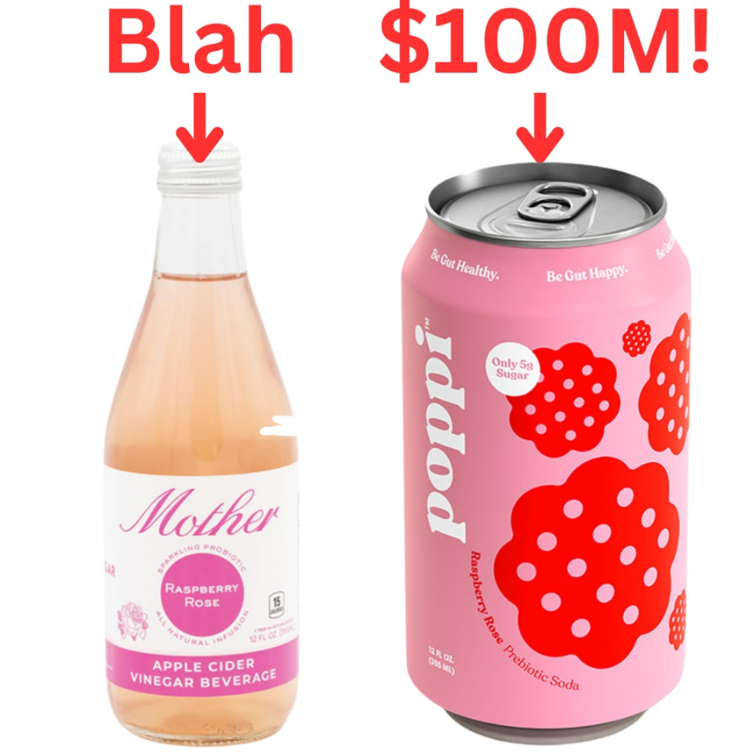
A complete overhaul transformed "Mother," an apple cider vinegar beverage, into "Poppi," a prebiotic soda, resulting in $100 million in...
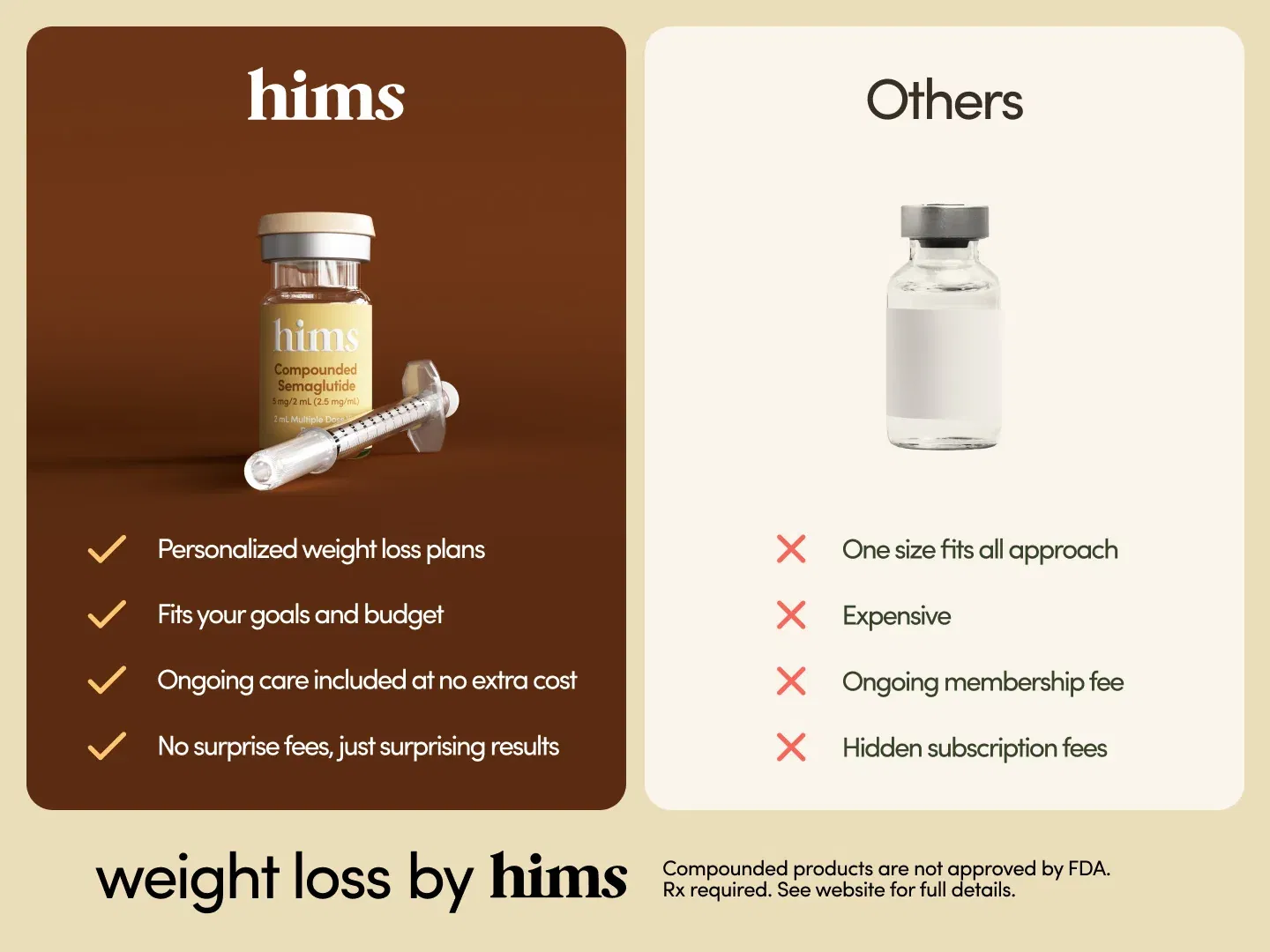
I thought this ad by Hims was super easy to understand by providing a simple comparison chart between their service...
Search for a command to run...