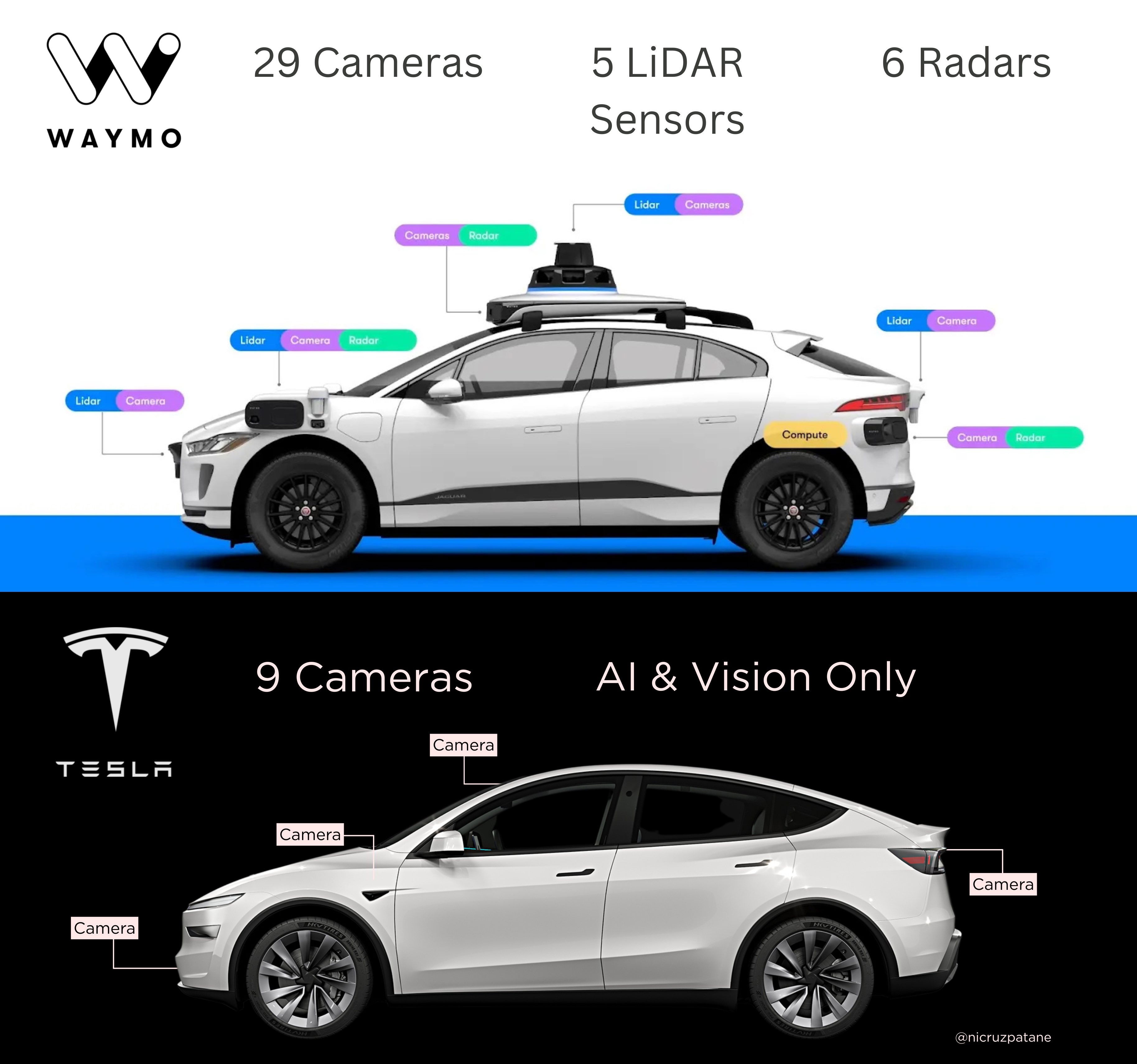
Waymo vs Tesla Sensor Suite
Updated on

This side-by-side image of Tesla and Waymo tells a clear story: one bets on fewer sensors and smarter software, the other piles on hardware for precision. It’s not just about cars. It’s a lesson in branding and strategy.
Marketing Analysis
Tesla’s approach screams confidence and focus: “We trust our AI.” Waymo’s design shouts control and safety through redundancy. Both are valid, but they appeal to very different buyers—tech minimalists vs. cautious reliability-seekers.
Why It Works
- Tesla’s clean setup = clear message.
- Waymo’s packed stack = strong reassurance.
- Each visual instantly communicates brand philosophy.
- Contrasting visuals create identity by opposition.
Examples
- Apple removed ports to signal simplicity and progress.
- Dyson ads highlight fewer moving parts—less can go wrong.
- IKEA’s minimalist layouts sell “smart simplicity” over flashiness.
- Mercedes uses heavy tech dashboards to convey safety and control.
Analyzed by Swipebot
Loading analysis...
