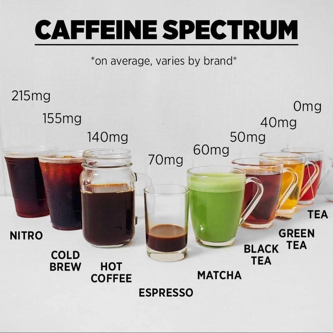
This caffeine chart nails it. Instead of dumping numbers into a table, it shows drinks side by side so you feel the difference instantly. One glance and you know nitro coffee hits way harder than green tea.
Why It Works
- Visual hierarchy makes the info obvious without reading.
- Uses familiar objects (drinks) to anchor the data.
- Keeps context consistent—same angle, same cups, same lighting.
- Simplicity builds trust and clarity.
Real-World Examples
- Apple’s battery life bars—simple visual, fast comprehension.
- Spotify Wrapped—turns data stats into fun visual stories.
- Strava heatmaps—show activity patterns with color intensity.
- Sleep tracking apps—graphs make trends instantly digestible.
Analyzed by Swipebot
Loading analysis...
