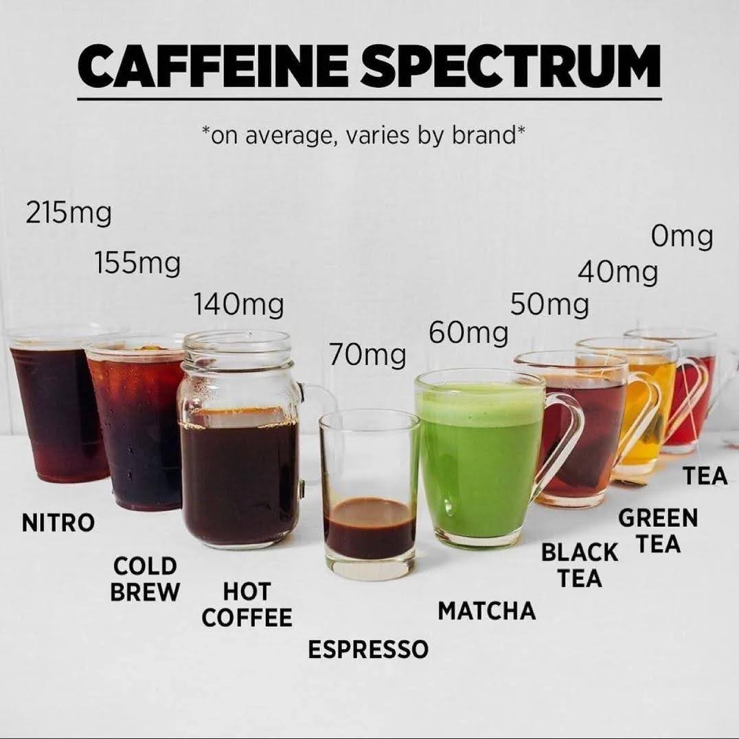
Easily visualize the caffeine content you’re getting from different drinks with this cool graphic.
This is generalized data, actual content can greatly vary.


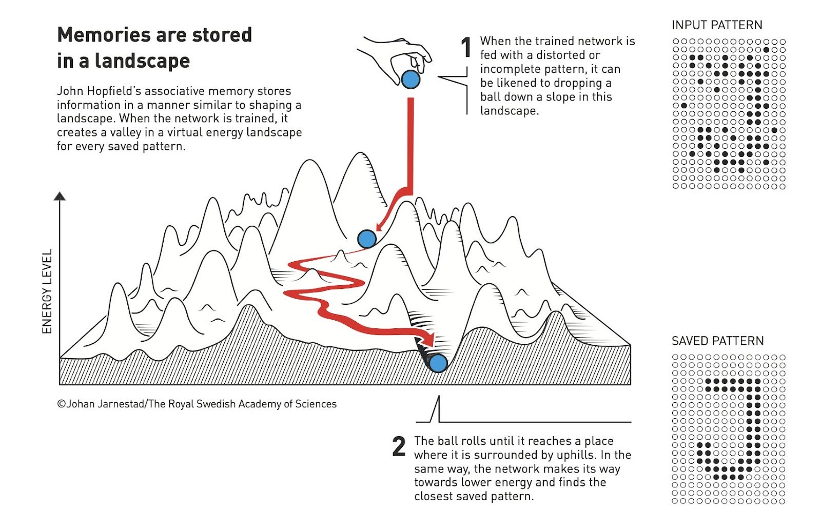
This is an interesting analogy to how memories are made in your brain AND in computers. In your brain well-worn...
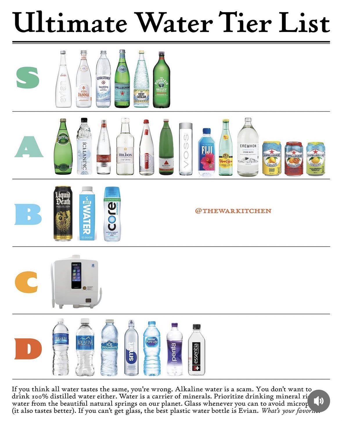
According to @thewarkitchen these are the best types of water.I personally have no idea how to rank water, I just...
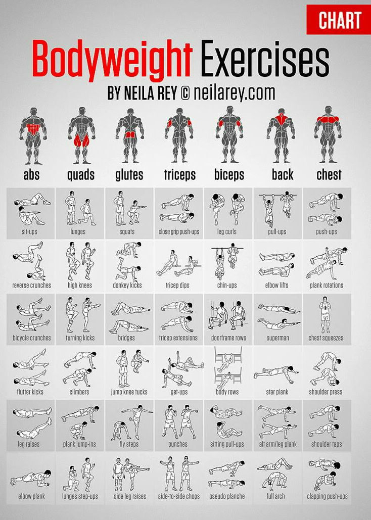
I love when a single image just has tooonnssss of information you can use on it.

I love the simple use of a sleeping person with arrows pointing to each part along with a simple tip...
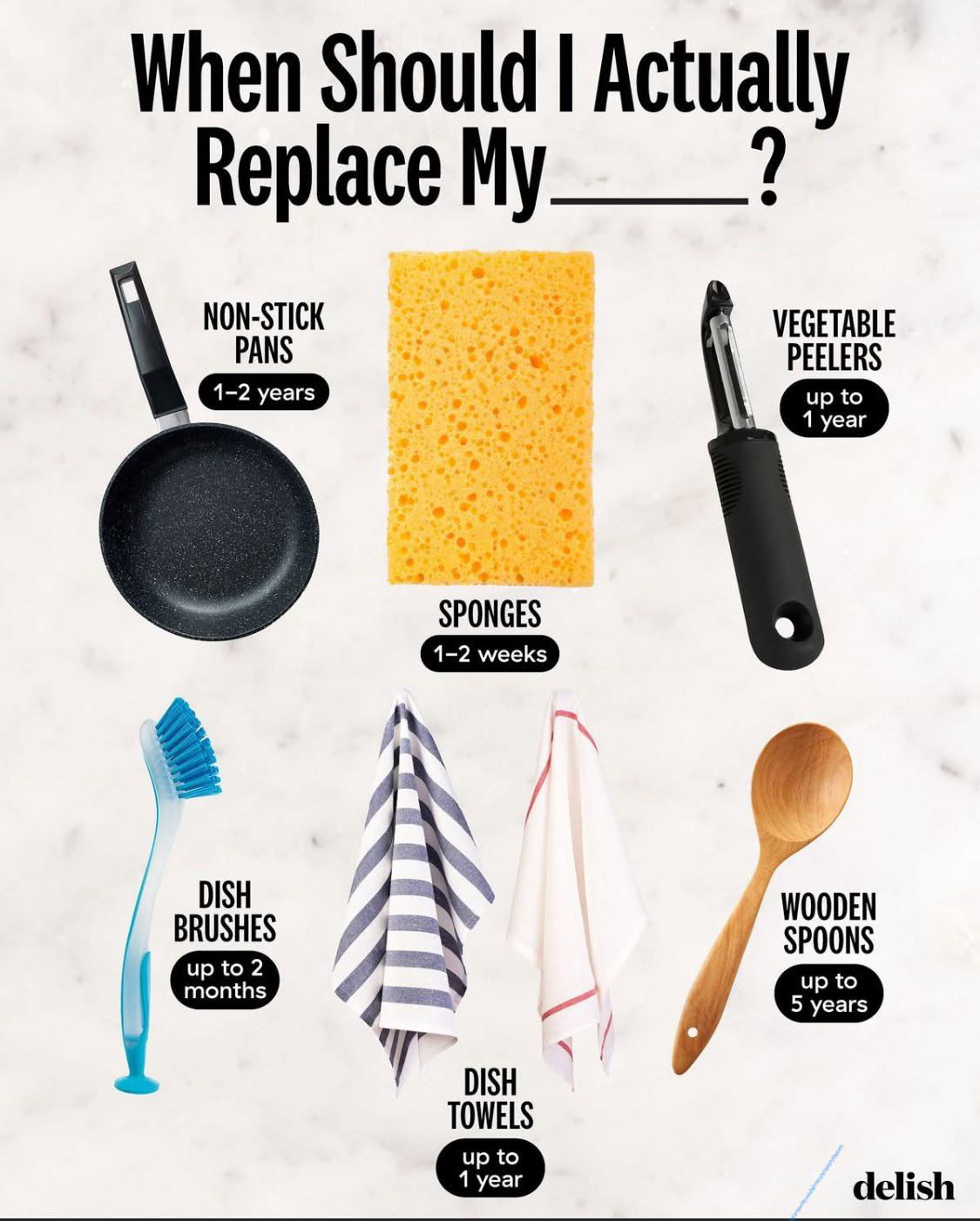
An easy graphic that shows some estimated data on when to replace common kitchen utensils.
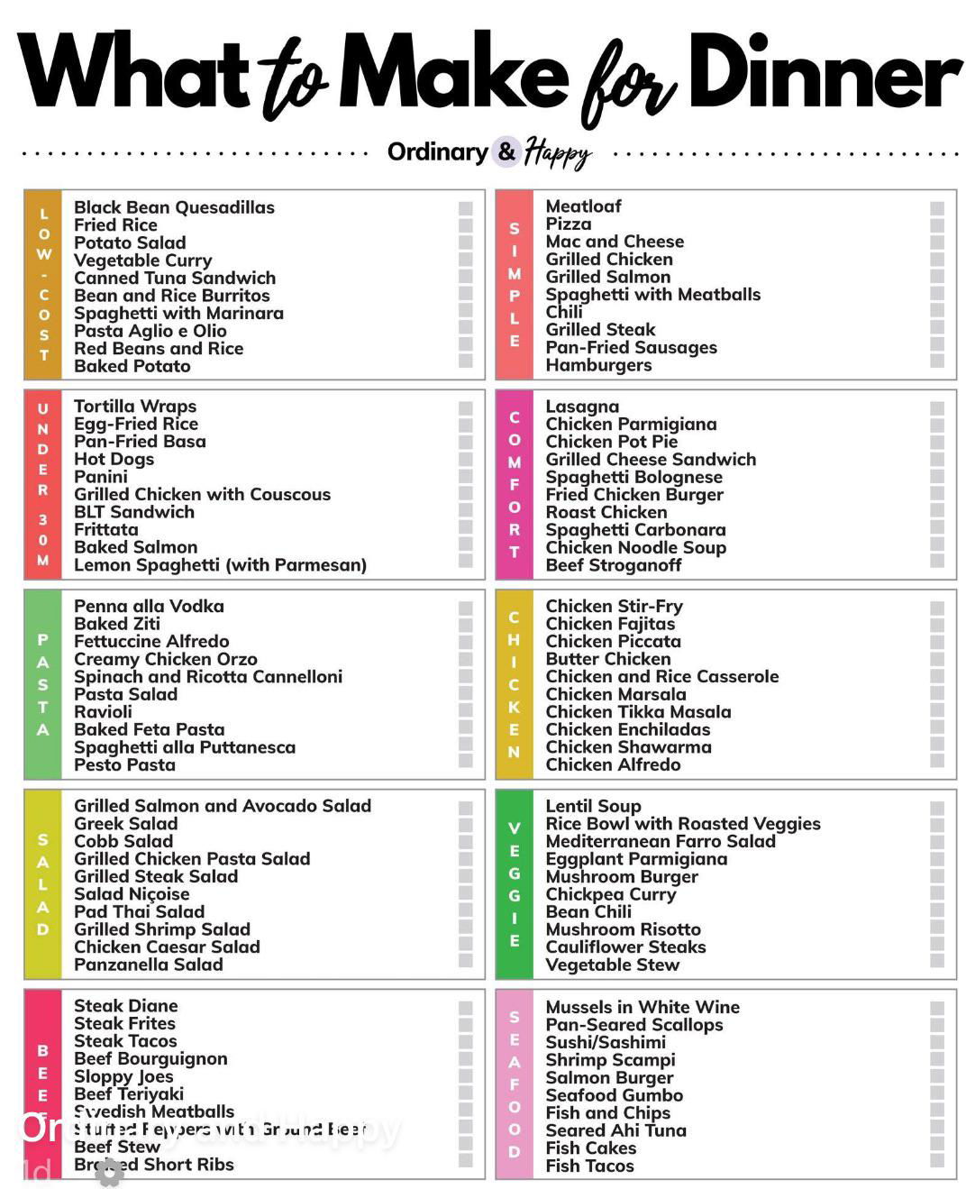
This simple chart with no images gives a list of what to make for dinner based on different categories like...
Search for a command to run...
This is an interesting analogy to how memories are made in your brain AND in computers. In your brain well-worn...
According to @thewarkitchen these are the best types of water.I personally have no idea how to rank water, I just...
I love when a single image just has tooonnssss of information you can use on it.
I love the simple use of a sleeping person with arrows pointing to each part along with a simple tip...
An easy graphic that shows some estimated data on when to replace common kitchen utensils.
This simple chart with no images gives a list of what to make for dinner based on different categories like...
Search for a command to run...