Clever Coffee Graphic Off/On
Updated on
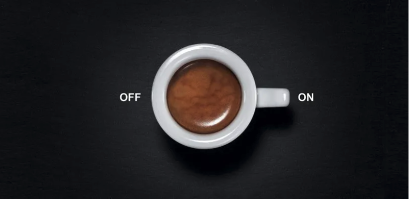
A cup of coffee becomes an ON switch. Simple, visual, and brilliant. The image plays with words and design—no copy needed to sell the feeling of “wake up.”
Marketing Analysis
The cup’s handle looks like the toggle on a power button. Your brain fills in the metaphor before you even realize it. Eye-tracking shows everyone’s focus hits the coffee first, then follows the handle to the word “ON.” That’s guided attention done right.
Why It Works
- Uses visual metaphor instead of words
- Minimal design makes the message pop
- Eye-flow leads users to the punchline
- Triggers emotion and recognition instantly
Examples
- Apple used simple switch icons to communicate entire actions with no words.
- Nike’s swoosh symbolizes motion and “go.”
- FedEx’s hidden arrow implies speed and direction.
- Spotify’s green circle shows “play” and energy.
Analyzed by Swipebot
Loading analysis...
