Comparison of Africa's Landmass To Other Countries

Data
Images
Jan 3, 2025
True size of aftica.png

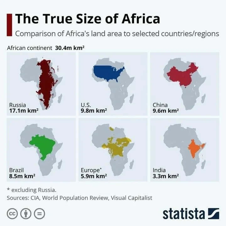
I love when a single graph or chart can update how you think about something. It's quite shocking to know the entire United States could fit into just the top of Africa with plenty of space to spare.

Image Description

The image is a chart titled "The True Size of Africa" and compares Africa's land area (30.4 million km²) to several countries/regions: Russia (17.1 million km²), the U.S. (9.8 million km²), China (9.6 million km²), Brazil (8.5 million km²), Europe excluding Russia (5.9 million km²), and India (3.3 million km²). Each country is visually overlaid on the outline of Africa to illustrate the size comparison.

Positive Aspects

  • The image effectively uses visual overlays to demonstrate the vastness of Africa's landmass compared to other large countries and regions.
  • It clearly and simply communicates a surprising fact about Africa's size, making it a powerful tool for updating perceptions.
  • The use of different colors for each country aids in differentiating and comparing them at a glance.

Key Takeaways

  • Africa's landmass is significantly larger than many individual countries, including the U.S., China, and India.
  • The entire United States could fit into Africa with substantial space remaining.
  • Visual representations can powerfully challenge and change preconceived notions about geographical sizes.

Additional Insights

  • This kind of visual comparison can be a game-changer in geography education, offering a more accurate understanding of global scales.
  • It's a reminder of how maps can sometimes distort perceptions; the Mercator projection, commonly used in world maps, often underrepresents Africa's true size.
  • Next time you're looking at a world map, remember this chart—it might just change how you see the world!
Join Copywriting Course!
Write. Learn. Take action.
Join Now →