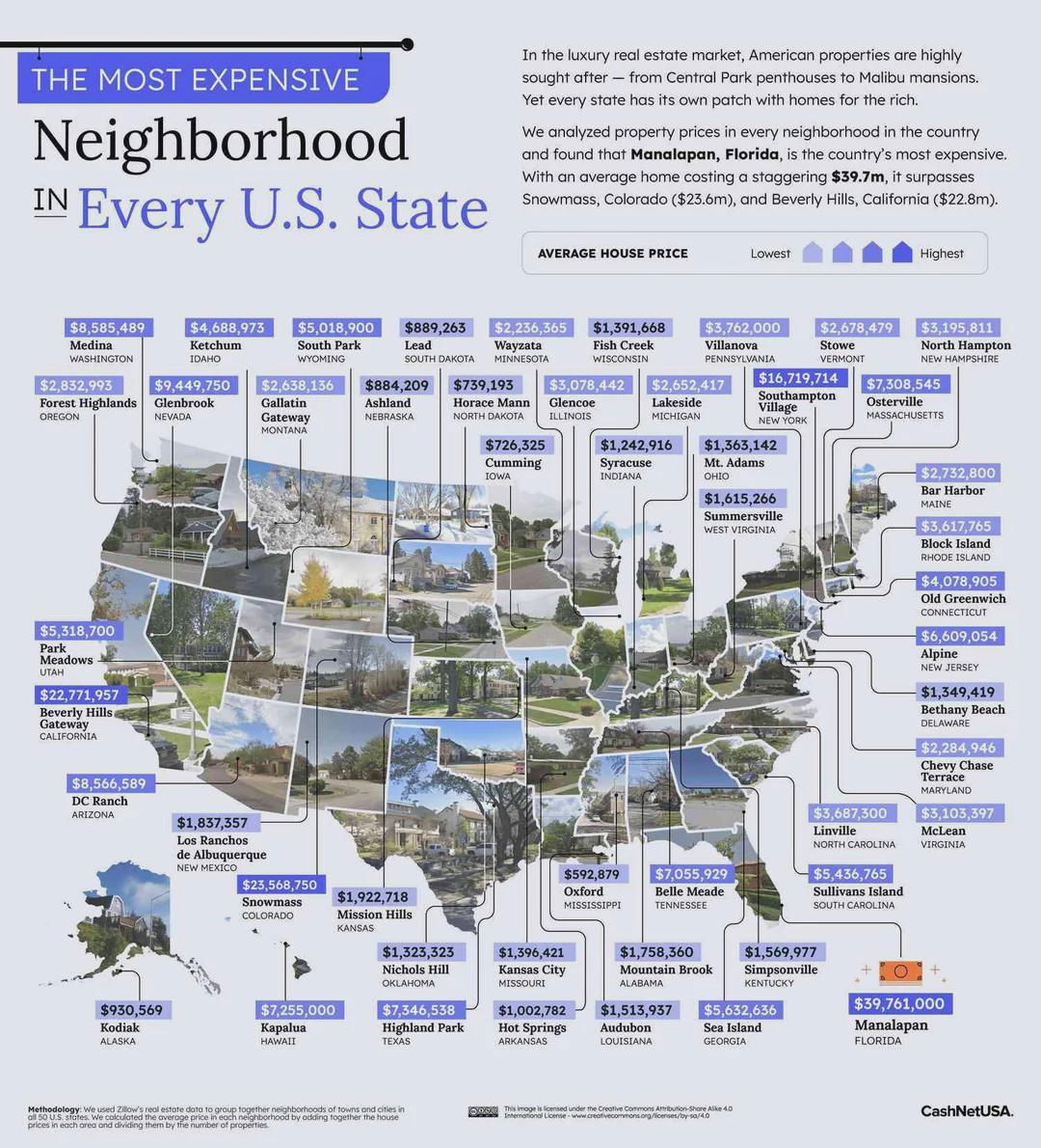
A plain spreadsheet of real estate prices is boring. But add photos, colors, and location labels, and suddenly you’ve got a story about luxury, lifestyle, and geography. That’s what this “Most Expensive Neighborhood in Every State” map does brilliantly.
The Marketing Lesson
Instead of dumping numbers, it visualizes them. Each state gets a picture of its priciest neighborhood and an average home price tag. This combo converts cold data into an emotional, scroll-stopping experience.
Why It Works
- Pictures trigger curiosity faster than stats.
- Easy-to-scan layout encourages engagement.
- Comparison across states invites sharing and discussion.
- Taps into aspirational content—people love luxury tours.
Real-World Examples
- Zillow uses map-based heatmaps to drive engagement.
- Spotify Wrapped visualizes listening data users can brag about.
- Airbnb’s market insights show top-earning cities with eye-catching maps.
Analyzed by Swipebot
Loading analysis...
