ConversionWise CRO Comparison Graphic
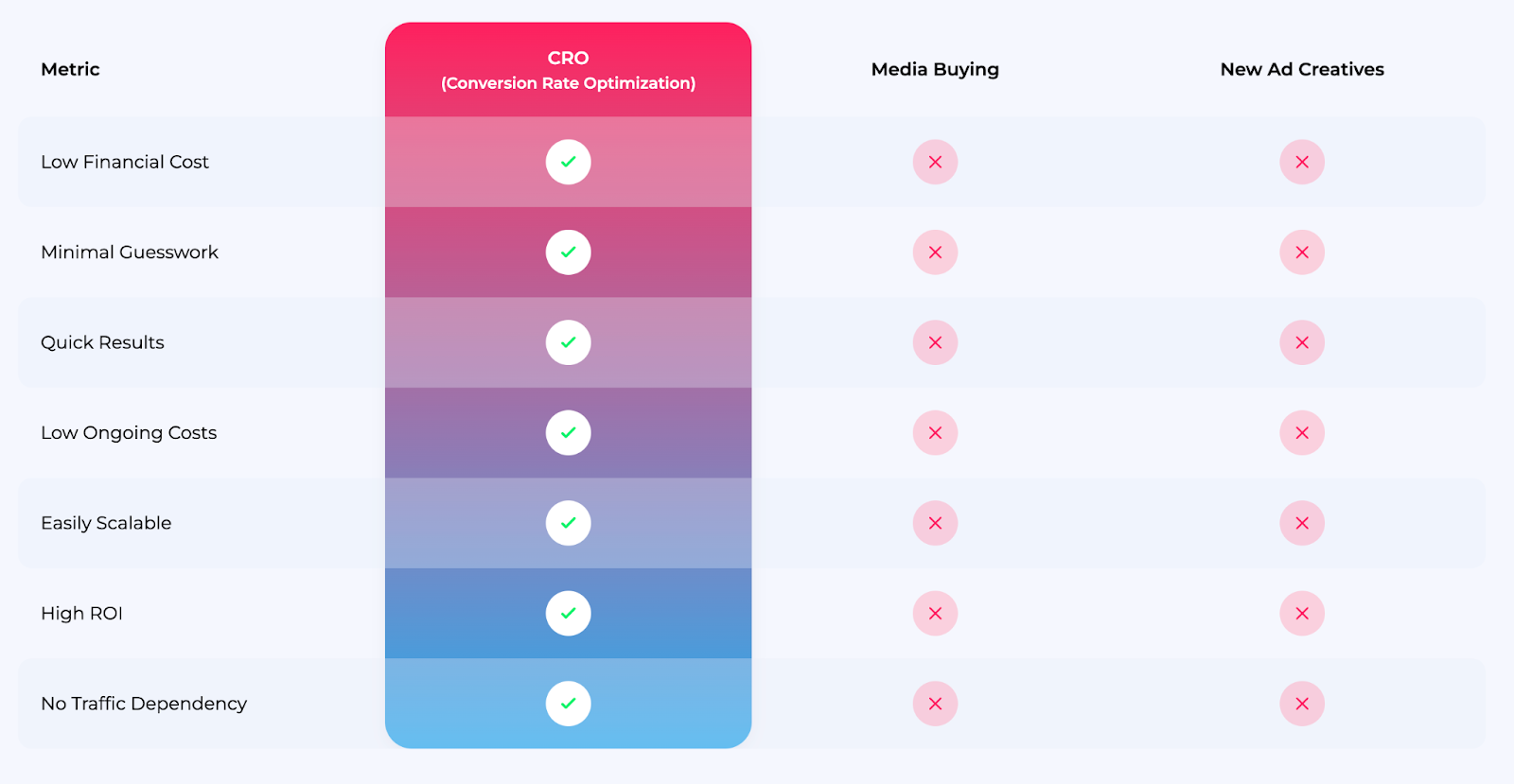
This chart from ConversionWise nails the perfect visual pitch. It quickly shows how their CRO service stacks up against media buying and new ad creatives. In one glance, you see CRO winning across every metric.
Why this chart slaps
- Uses contrast to make the “winner” obvious
- Turns complex benefits (ROI, cost, scalability) into a visual checklist
- Leverages simplicity—no words wasted
- Builds authority by framing competitors side-by-side
Real-world knockouts
- Apple often uses clean comparison grids to demo why their devices outperform others.
- Shopify highlights “no coding needed” next to competitors with tech-heavy requirements.
- Slack contrasts time saved vs. email chains to showcase productivity benefits.
A chart like this sells because it makes saying “yes” effortless.
Analyzed by Swipebot
Loading analysis...
