ConvertKit Software Explainer Page
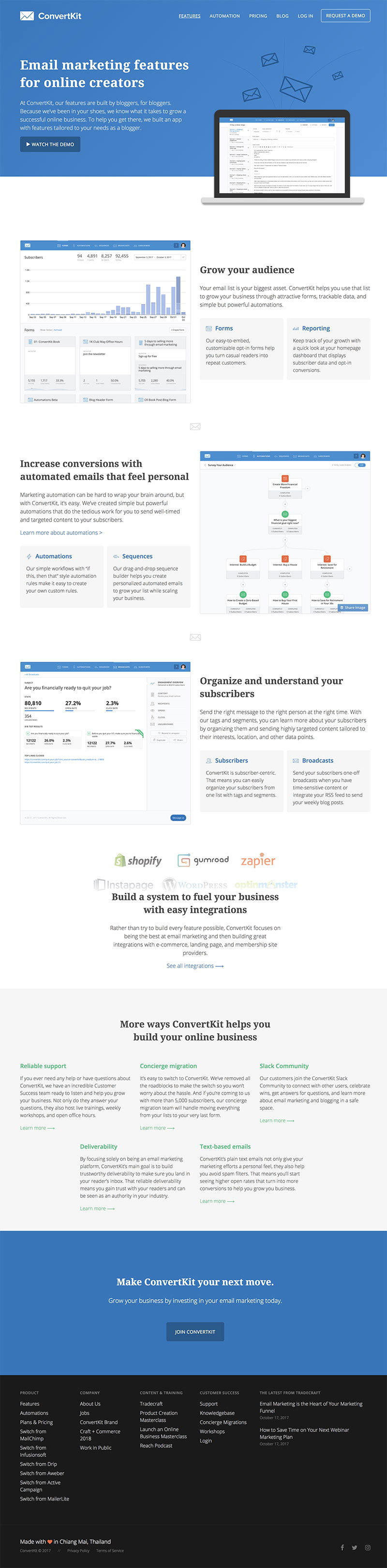
ConvertKit nailed their feature page by keeping words light and visuals heavy. Instead of explaining what their tool can do, they just show you. Screenshots, GIFs, and videos let visitors instantly “get it” without reading walls of text.
Marketing analysis
Every feature section acts like a mini demo. The visuals keep your attention, remove friction, and make the product feel tangible. The result? Fewer doubts and faster buying decisions.
Why it works
People believe what they see
Motion grabs attention and keeps it
Visual proof builds trust instantly
Less cognitive load = faster understanding
Examples
ClickUp shows task creation in a 3‑second GIF
Notion loops short clips of templates
Slack demos integrations in mini videos
Figma’s homepage visually walks through design flow
Shopify videos show stores launching in minutes
