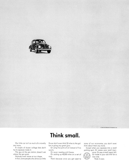
DDBs Volkswagen’s Think Small Print Ad

In 1959, Volkswagen pulled off one of marketing’s boldest moves: a tiny Beetle surrounded by a sea of white. The headline? “Think small.” No flashy claims. Just space, honesty, and smarts.
White space that sells
That blank background wasn’t empty. It directed your eyes exactly where VW wanted: first the car, then the message. Clean layout, laser focus. That’s visual hierarchy doing overtime.
Why it works
White space grabs attention through contrast
Design reinforces the product story
Understatement builds authenticity
Simplicity makes it unforgettable
Modern echoes
Apple: minimal “Think different” ads with massive whitespace
Google: one logo, one search box
Nike: three words, endless power — “Just do it.”
Analyzed by Swipebot
Loading analysis...
