EBITDA Explained in one image
Updated on
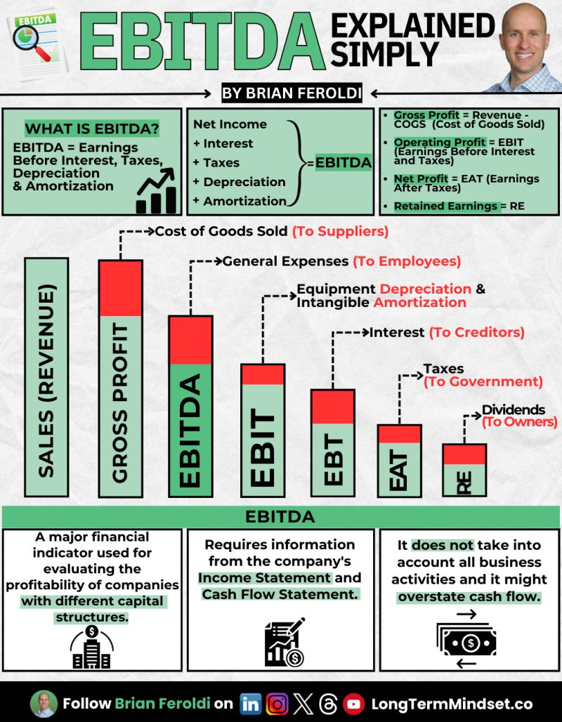
Ever heard Buffett call EBITDA “bulls**t earnings”? That’s because this little acronym likes to make companies look way shinier than they are. Brian Feroldi’s infographic breaks it down simply — showing how EBITDA skips key real-world costs like taxes, debt payments, and depreciation.
Marketing Analysis
Brian’s chart uses bold colors, clear step-down visuals, and easy math definitions. It visually demonstrates how each expense slices away from sales to actual profit. This visual hierarchy teaches faster than any paragraph ever could.
Why It Works
- Turns complex finance into bite-sized chunks
- Uses color contrast to guide the eye
- Shows the cost journey from sales to take-home profit
- Makes “invisible” costs visible in one picture
Examples
- SaaS founders flaunting 40% EBITDA margins… while burning cash.
- Tesla once posted “positive EBITDA” quarters while still losing billions.
- Private equity decks often lead with EBITDA to pump valuation before due diligence.
Analyzed by Swipebot
Loading analysis...
