Family Relationship Chart
Updated on
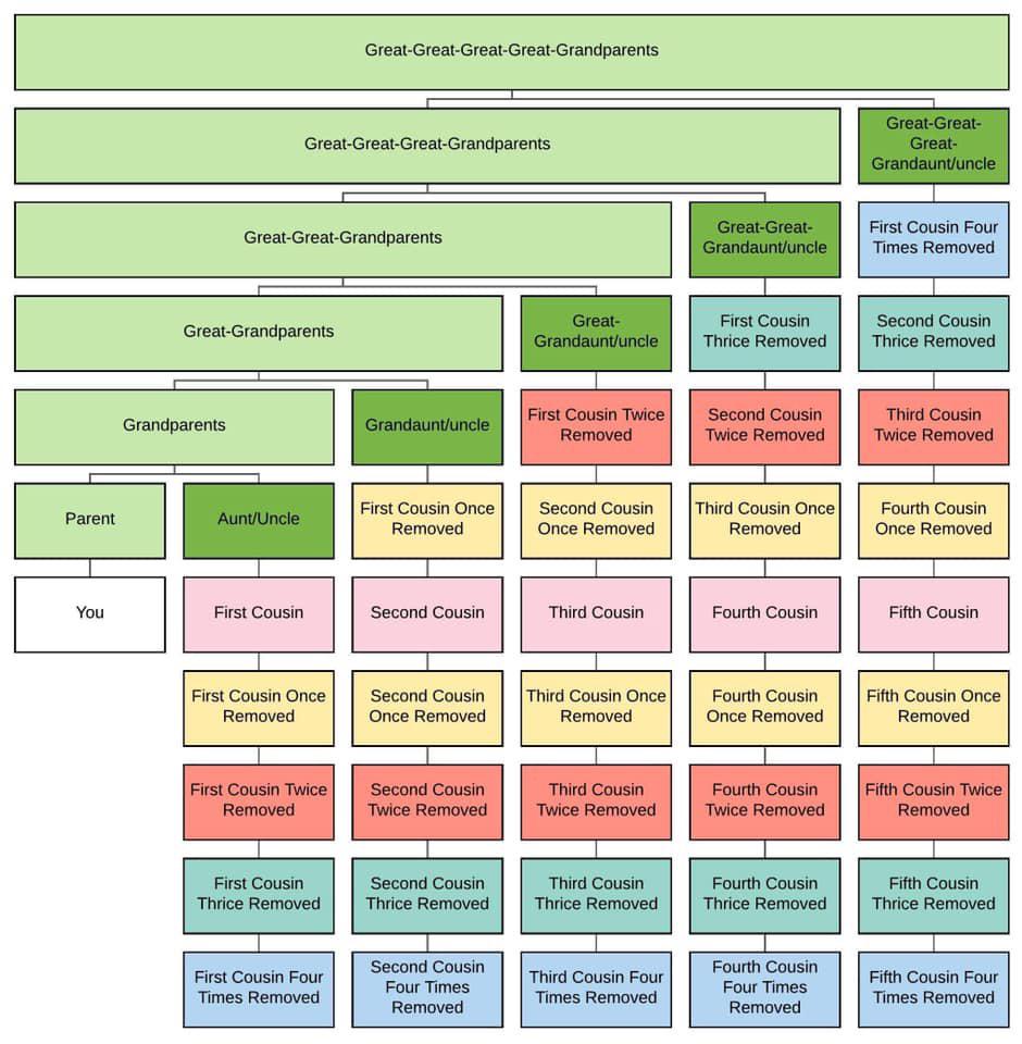
Ever seen a family tree that tracks cousins “four times removed”? It’s complicated, but visual. And that’s what makes it powerful.
Marketing analysis
This chart does what great marketing visuals do: it simplifies chaos. Each box, color, and connection helps you see relationships you’d never catch in text. Good marketers do the same with customer journeys or funnels—turn abstract relationships into something your brain can actually grasp.
Why it works
- Turns confusion into clarity through structure
- Uses color coding to organize multiple layers
- Visual hierarchy guides your eye step-by-step
- Helps retain complex info quick
Examples
- HubSpot’s funnel diagrams show customer stages in one glance
- Airbnb’s host-onboarding flow makes a tricky process look easy
- Google Analytics uses nested visuals to explain traffic sources
- Apple’s product ecosystem map shows every device connection clearly
Analyzed by Swipebot
Loading analysis...
