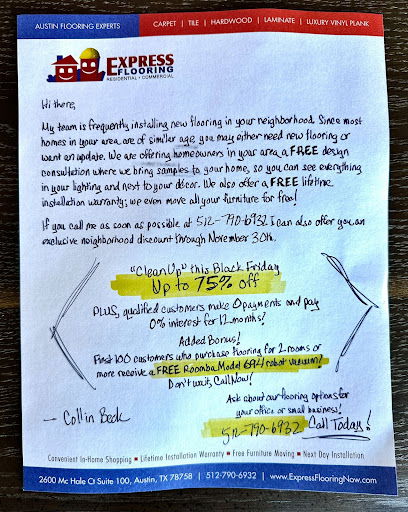
“Handwritten” commercial flooring direct mail flyer
Updated on

This flooring company nailed that “friendly neighbor” vibe with a simple trick: handwriting. The flyer looks like someone personally wrote it, complete with highlights, arrows, and notes. That grabs attention in a pile of boring mail.
Marketing analysis
Everything about this flyer screams human. It’s casual, colorful, and direct. The “first 100 customers get a free Roomba” offer creates urgency and adds a tangible bonus. The only weak spot? The back is a snooze—no visuals or proof of their flooring work.
Why it works
- Handwriting builds trust and feels one-to-one
- Highlighter colors guide the reader’s eyes
- Scarcity (“first 100 customers”) prompts quick action
- A valuable freebie sweetens the deal
- Local references make it personal
Examples
- Ooni sends rustic-looking mailers that feel homemade
- Postcards from realtors with handwritten notes boost response rates by 20%+
- Charity: water letters with real signatures outperform printed appeals by double
Analyzed by Swipebot
Loading analysis...
.png?width=3840&quality=80)