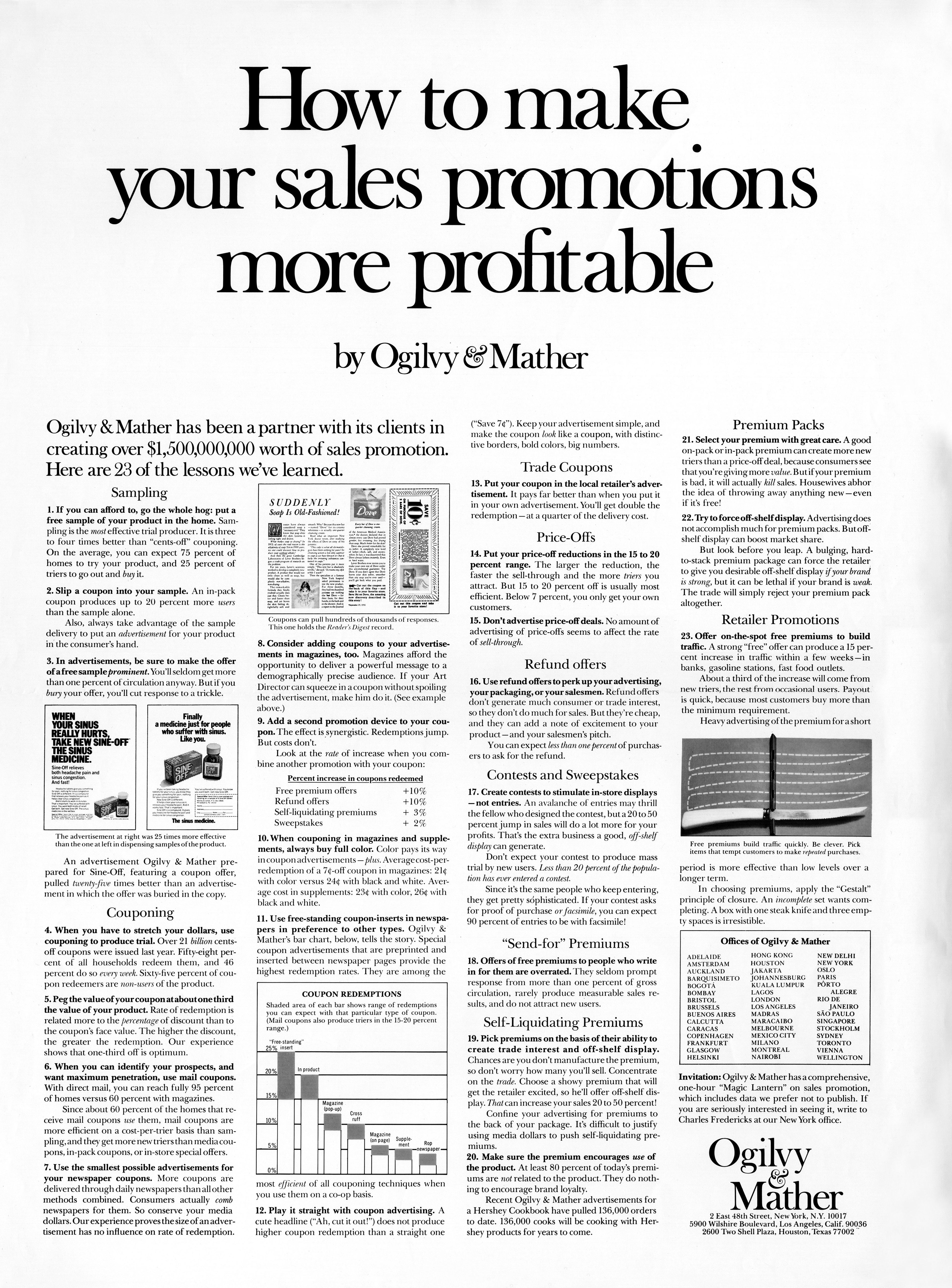
How to make your sales promotions more profitable advertorial

Ogilvy didn’t just write killer headlines—he engineered how people looked at ads. His “How to make your sales promotions more profitable” layout is basically a visual roadmap for reader attention.
Marketing analysis
Look at the ad’s structure: a bold headline dominates, then the eye slides to visuals and charts before ending with the logo. Heatmaps prove readers follow that exact path. Ogilvy mapped attention before designers even had eye-tracking tech.
Why it works
- Big bold headline promises value instantly
- Visuals act as anchors pulling attention
- Logical flow keeps readers moving naturally
- White space makes dense info digestible
- Visual hierarchy decides what gets seen first
Examples
- Apple’s site: product first, then buying button
- Mailchimp: headline → image → proof → CTA
- The New York Times ads use the same scanning path for clarity and authority
Analyzed by Swipebot
Loading analysis...
