How much should you spend on advertising advertorial
This old-school Ogilvy & Mather ad is what happens when words and layout shake hands perfectly. A heatmap of it shows how readers' eyes follow an intentional path—headline first, then proof, then data. That’s copywriting and design in sync.
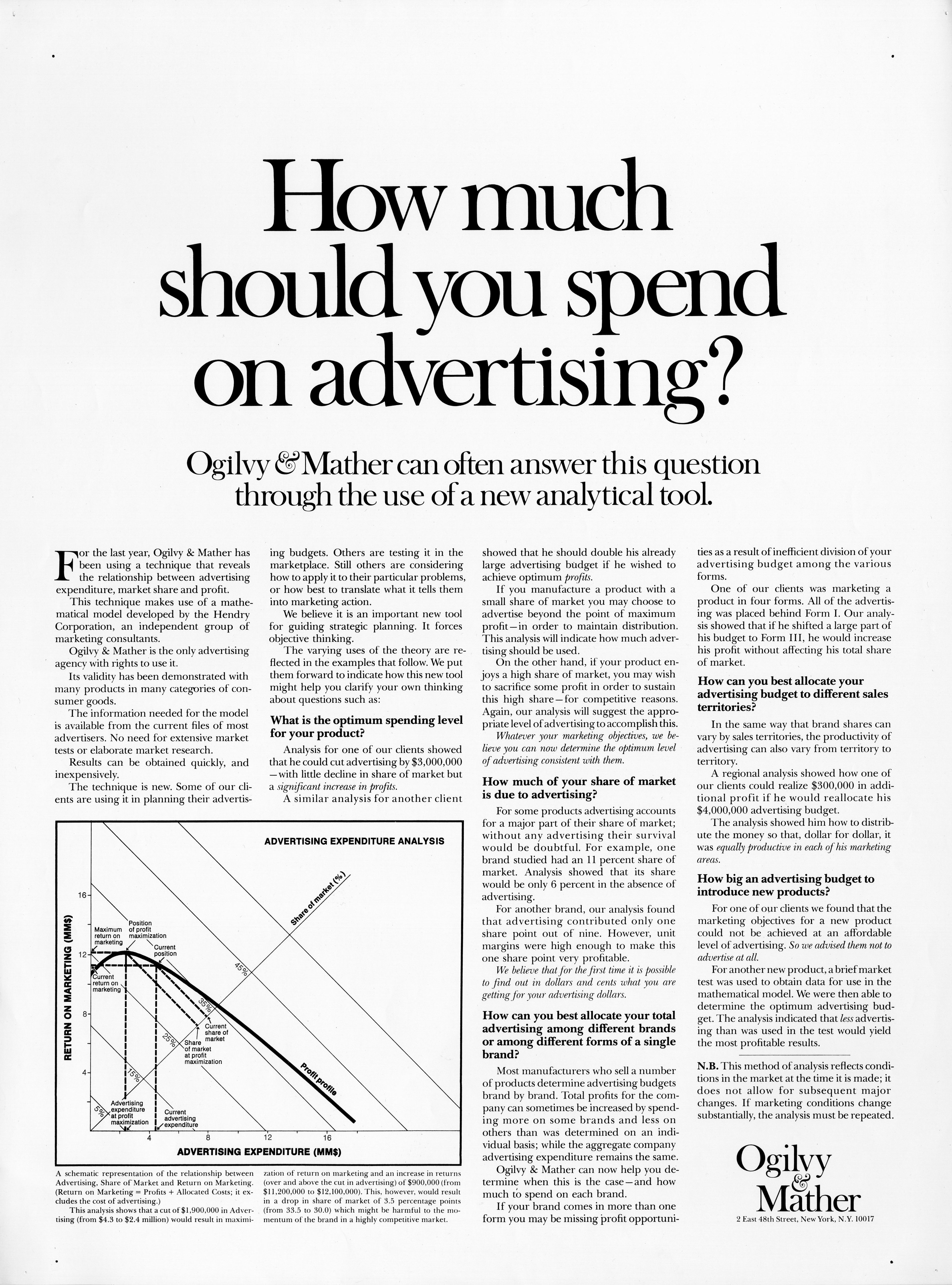
Marketing analysis
Nearly 80% of the reader’s attention lands on the big question headline at the top. From there, the eye travels down to the subheadline (credibility) and then to the chart (proof). Every piece of spacing and typeface choice gently pushes the reader where Ogilvy wanted.
Why it works
- Giant serif headline dominates at first glance
- Subheadline instantly builds trust
- Logical reading path keeps attention moving
- White space = fewer distractions = higher clarity
- Chart adds factual weight to emotional claims
Examples
- Apple’s homepage starts with one bold benefit line
- HubSpot’s case studies use stats as subheads
- The New York Times email opt-in page guides eyes top to bottom with bold typography and white space
Analyzed by Swipebot
Loading analysis...
