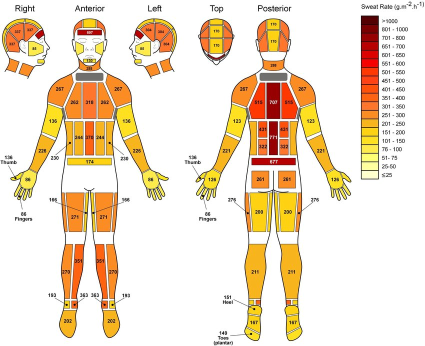
Ever wondered how much you sweat and where? There's actually a chart for that. I really like the simple colors and callouts in this chart, which make it easy to read.


A simple chart with unemployment and "underemployment" rates by college major makes this data visually interesting by making the bar...
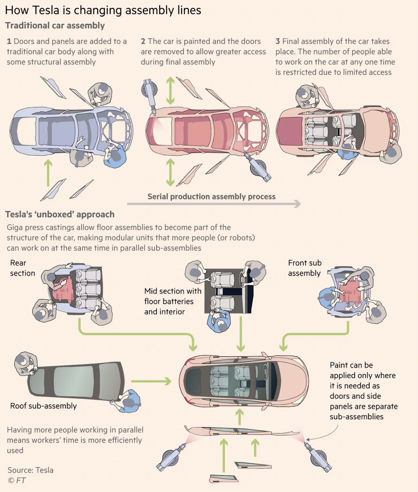
Illustrations showing difference between traditional assembly lines and Tesla "unboxed" approach.

This is a pretty cool graphic that shows the progression of how the Tesla headlights look from 2012 all the...
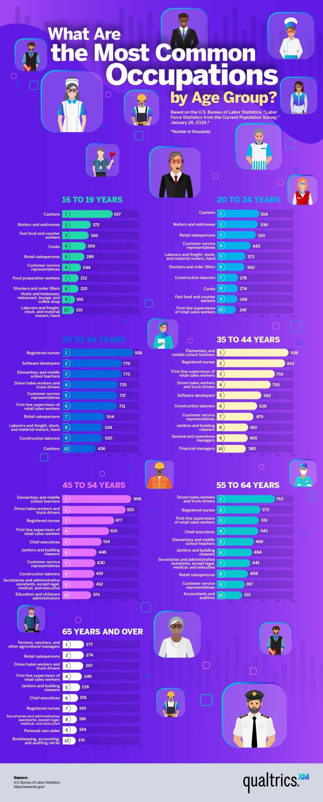
This was an interesting way to show data of the most common jobs by AGE.The data showed:16 to 24 years:...
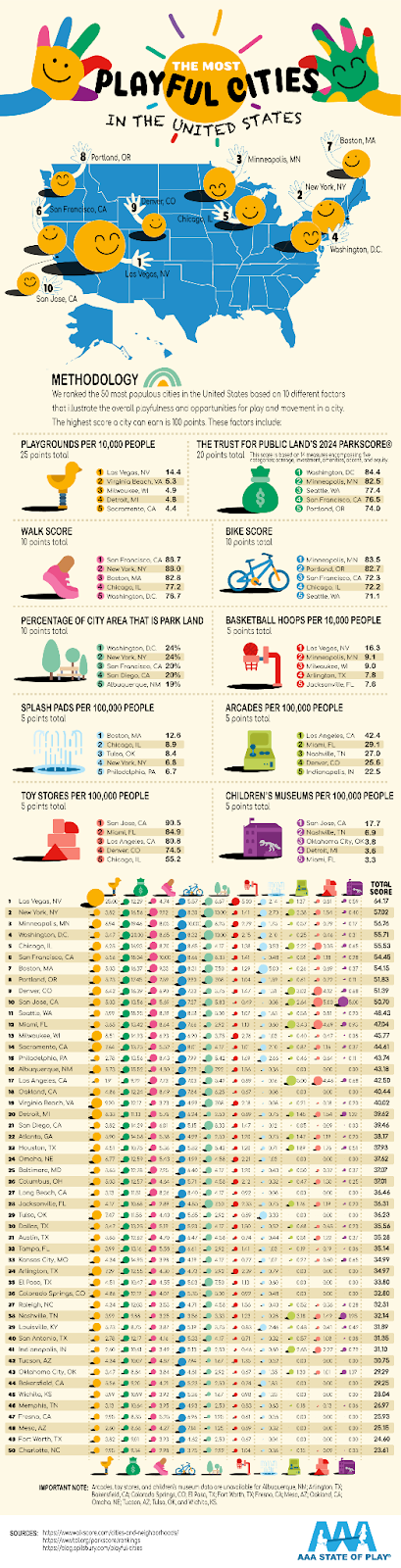
This pictograph illustrates the cities with the most playfulness by counting the number of playgrounds, splash pads, toy stores, walk...
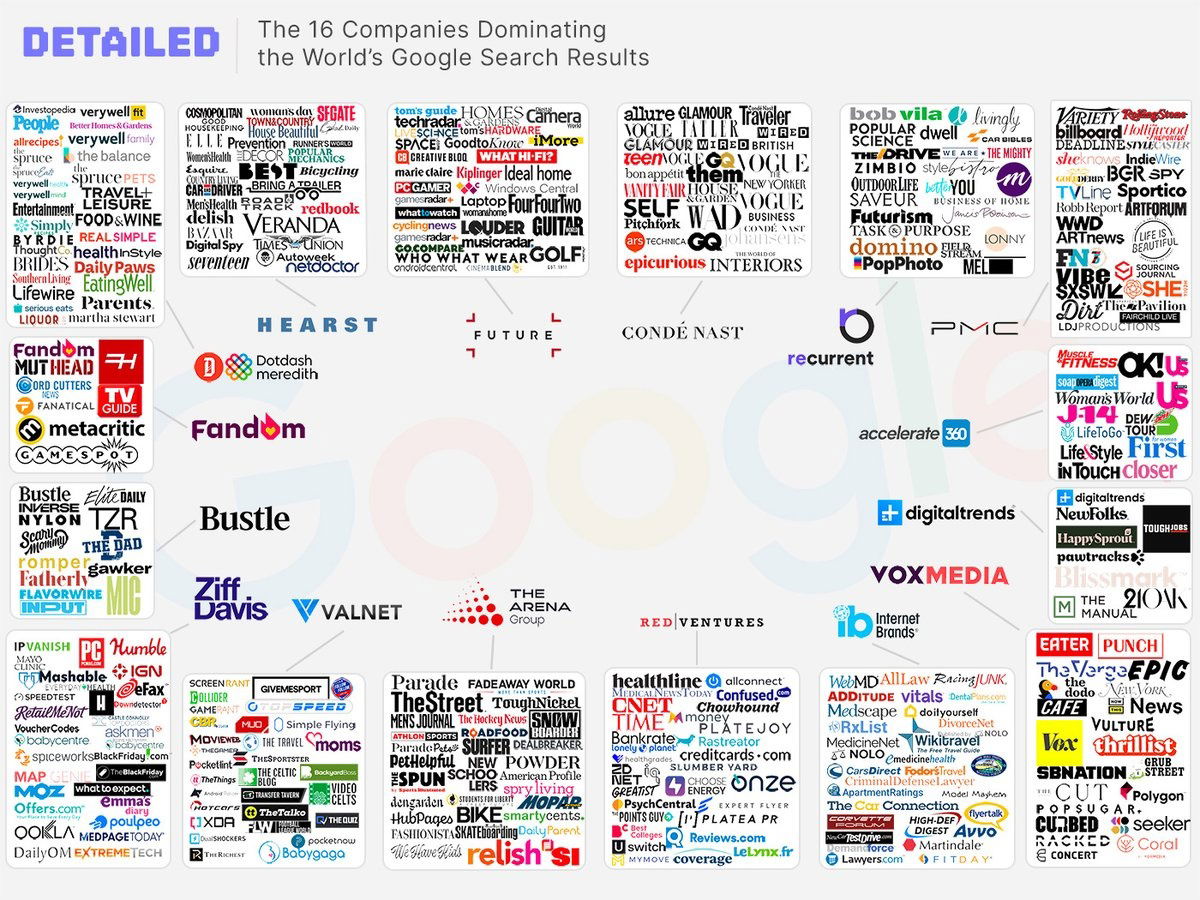
This image shows how 16 main brands control the SEO on google. Why I think the review industry sucks:basically 16...
Search for a command to run...