Which countries have the worlds most powerful passport infograph
Updated on
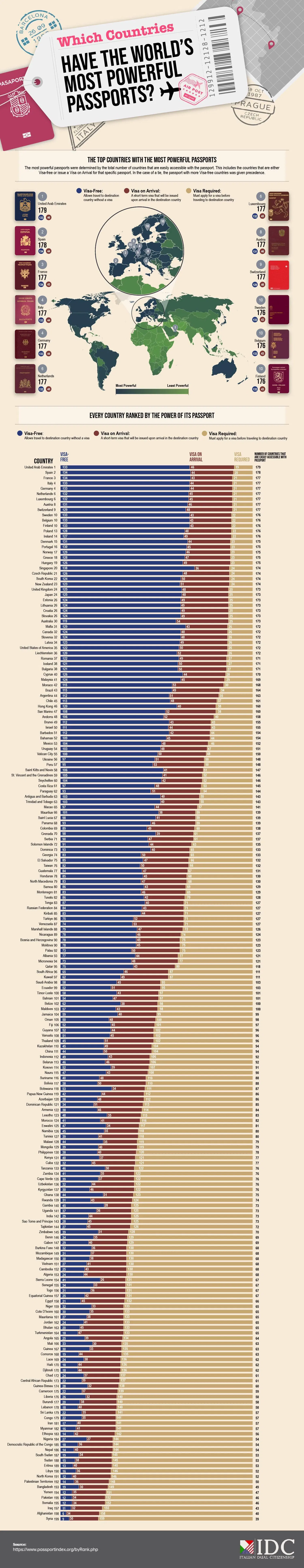
This passport infographic is a masterclass in visual storytelling. It instantly shows which countries’ citizens have the most travel freedom—and which don’t.
Visuals That Sell a Point Fast
You don’t need to read a paragraph to understand it. A quick glance and you feel the power dynamic. Blue equals mobility. Beige equals borders. That emotional contrast makes the message stick.
Why It Works
- Visual hierarchy makes complex data instantly scannable.
- Color contrast builds an emotional hook.
- Ranking format triggers curiosity (“Where’s my country on this list?”).
- Simplicity makes sharing irresistible.
Real-World Examples
- Spotify Wrapped: turns your data into shareable visuals.
- Netflix’s Top 10 list: uses ranking psychology to stir status and FOMO.
- HubSpot’s research charts: simple visuals that turn stats into stories.
Analyzed by Swipebot
Loading analysis...
