Largest Hedge Funds in 2022 Chart
Updated on
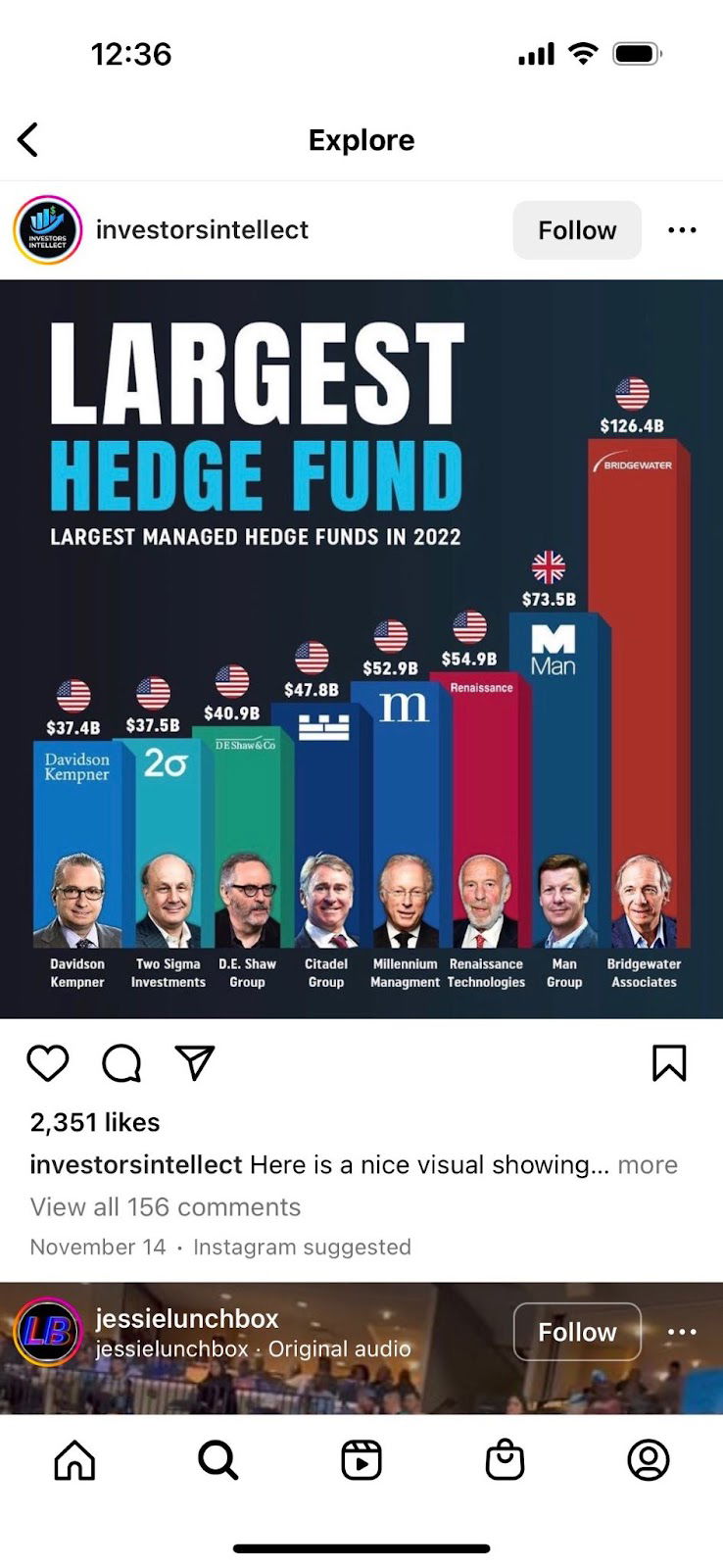
This chart showing the largest hedge funds hits hard because it makes complex data instantly digestible. No one wants to wade through a spreadsheet of numbers—but everyone will pause for a bold, colorful graph that tells a story in one glance.
Marketing Analysis
The post uses simple color contrast, consistent layout, and human faces to create hierarchy and emotional connection. The tallest bar (Bridgewater) immediately signals dominance, creating visual drama.
Why It Works
- Visual hierarchy makes comparison effortless
- Color coding keeps the eye engaged
- Human faces build credibility and warmth
- Big bold numbers tap into curiosity and ambition
Examples
- Spotify Wrapped: turns listener data into shareable charts
- NerdWallet: uses visual score comparisons to guide product picks
- Morning Brew: charts financial news simply and visually to earn shares
Analyzed by Swipebot
Loading analysis...
