80 pizzas and where they’re from
Updated on
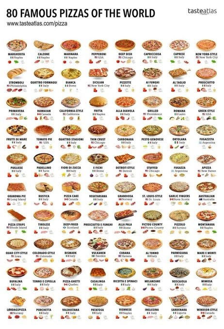
This single image lists 80 pizzas from around the world, complete with names, origins, and ingredients. It’s not just mouthwatering—it’s a brilliant example of packaging tons of info into a visual that’s instantly understandable.
Why This Chart Works
- Visual hierarchy: Each pizza image grabs your eye before your brain even reads a word.
- Data density: 80 distinct data points packed neatly without clutter.
- Global relevance: People everywhere love pizza, so universal appeal pulls you in.
- Curiosity trigger: Makes you instantly want to find “your” country’s pizza.
- Shareability: Perfectly built to go viral—tasty and educational.
Real-World Examples
- Spotify Wrapped summarizes personal data in bold infographics.
- Airbnb’s “Belong Anywhere” maps show listings worldwide visually.
- National Geographic uses food charts to teach geography through culture.
Analyzed by Swipebot
Loading analysis...
.png?width=3840&quality=80)