Much information, Very Small Space, Many Educational
Updated on
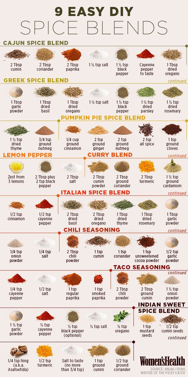
This “9 Easy DIY Spice Blends” graphic from Women’s Health nails one thing marketers always chase: turning complex info into something instantly usable and visually irresistible. It’s a cheat sheet you actually want to save.
Why it works
- Visual hierarchy: Each blend pops with color and clean spacing. You can scan and digest fast.
- Immediate utility: It’s not theory—it’s recipes you can use right now.
- Organization: Keeps consistency while letting each section shine with unique visuals.
- Trust factor: Credited source + useful info builds instant credibility.
Real-world examples
- IKEA instruction sheets: No words, just clear diagrams.
- Canva templates: Complex design made drag-and-drop easy.
- NYT Cooking infographics: Visual content that boosts engagement and saves users time.
Analyzed by Swipebot
Loading analysis...
