New Professionally Designed KopywritingKourse Sales Page
Updated on
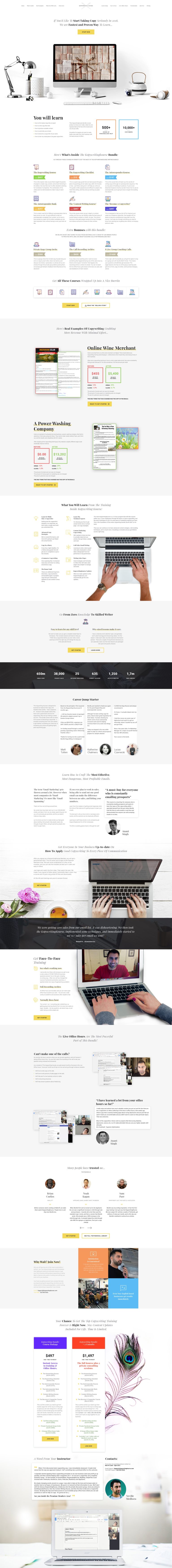
This sales page is like a crash course in how design and copy can team up to sell without shouting. It came out of a “Sales Page Experiment” and was professionally designed on 99 Designs. The result? A clean, trustworthy page that makes you want to click “buy.”
Why This Page Works
- Clear headline and subhead that instantly tell you what’s being sold
- Logical flow: problem → solution → proof → offer
- Smart use of white space makes reading effortless
- Visual hierarchy guides your eyes straight to the call‑to‑actions
- Proof stacked throughout (testimonials, screenshots, real results)
Real‑World Examples
- Basecamp uses calm layouts and proof-heavy copy to show reliability
- Grammarly’s site design leads users from a single CTA to demo instantly
- HubSpot landing pages use color contrast and whitespace to increase conversions
- Teachable’s course sales pages mimic this simplicity: benefit first, design second
Analyzed by Swipebot
Loading analysis...
