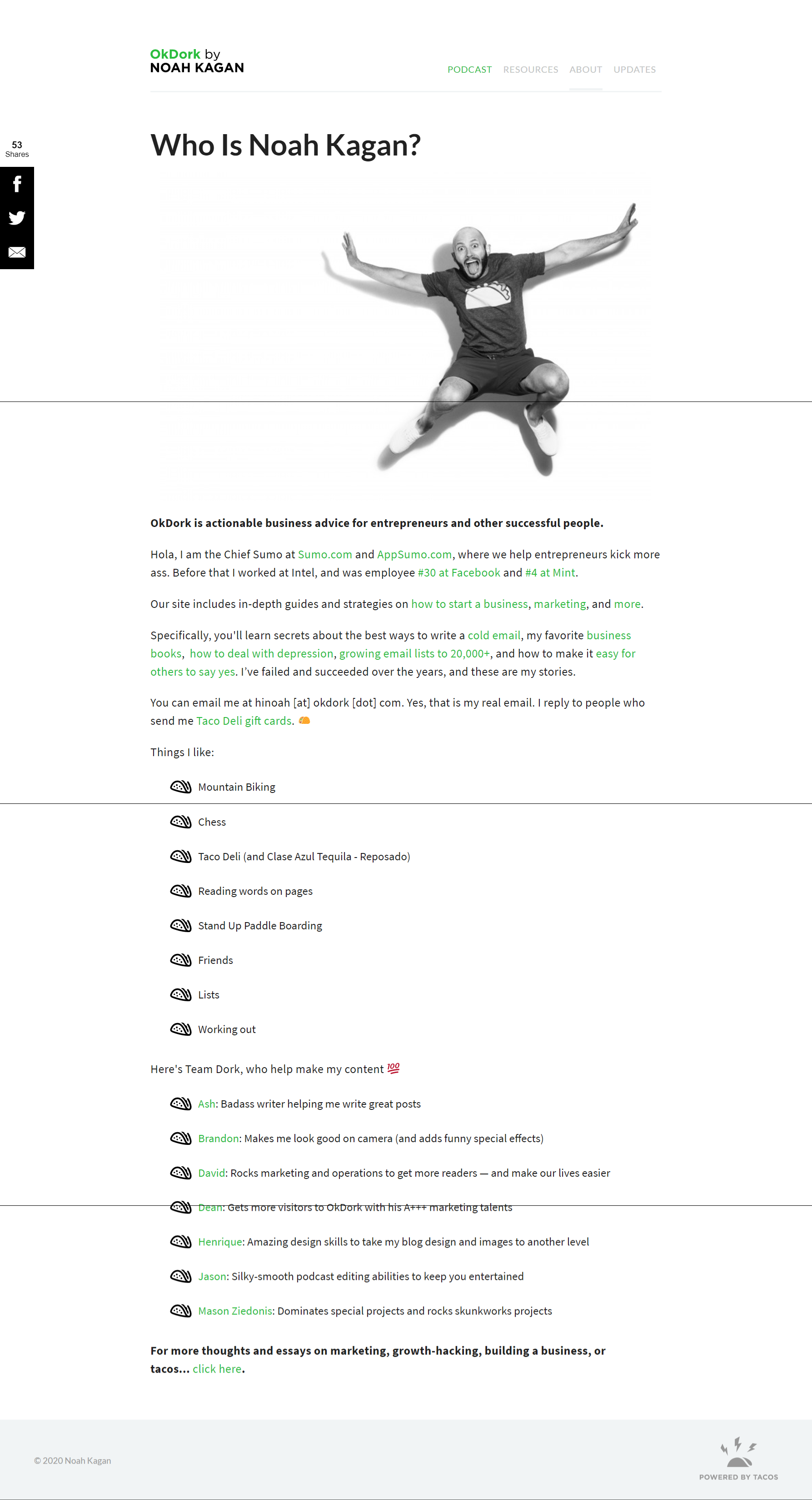
OkDork About Page
Updated on

Most About pages read like a LinkedIn summary glued to a website. Noah Kagan’s? It’s a handshake, a laugh, and instant trust all in one scroll.
Marketing analysis
His giant jumping photo screams personality. The copy talks to you, not at you. He slips in social proof—Facebook, Intel, AppSumo—but it feels like a story, not a brag. And just like that, you trust him enough to keep reading (and maybe buy something later).
Why it works
- Feels human, not robotic
- Subtle credibility drops build authority
- Easy-to-skim bullets keep readers hooked
- Humor and quirks make it memorable
- Ends with connection, not a sales trap
Examples
- Amy Porterfield opens with her mission, not her résumé
- Brian Dean’s bullets = fast-track trust
- Alex Hormozi highlights success numbers, not fluff
- Marie Forleo mixes heart and humor for instant rapport
Analyzed by Swipebot
Loading analysis...
