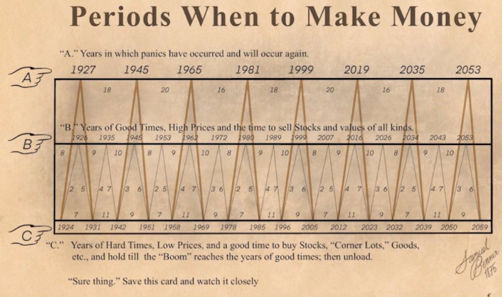
This old-school chart nails a timeless truth: markets rise and fall like clockwork. It’s a visual reminder that cycles happen, and panic or euphoria never last forever.
Marketing analysis
The magic here? Complex data made stupid simple. Instead of spouting graphs and trendlines, it shows a predictable up-and-down rhythm that anyone can get in seconds.
Why it works
- Turns abstract economics into a clear pattern
- Uses time-based framing to show inevitability
- Creates authority by predicting future “panics”
- Visual storytelling that sticks in your brain
Examples
- Ray Dalio’s “Economic Machine” video uses cycles to explain market moves
- Every “Crypto Winter” meme simplifies volatility like this chart
- Gartner’s Hype Cycle visualizes tech booms and busts with the same rise-crash pattern
Analyzed by Swipebot
Loading analysis...
