Reddit ad urging viewers to take a quiz
Updated on
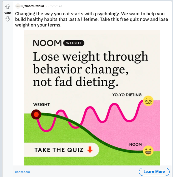
Noom nailed it with this visual. Instead of bragging about features, they show the problem and solution in one clean graphic: chaotic “yo-yo dieting” versus a smooth downward slope of steady progress.
Marketing analysis
That single squiggly line does all the storytelling. You instantly feel the frustration of diet ups and downs, then see calm progress as the ideal path. No words wasted. No diagram key needed.
Why it works
- Uses contrast: chaos vs calm
- Simple visual metaphor anyone can grasp
- Emotional payoff shown through happy/sad faces
- Focuses on outcome, not product features
Examples
- Calm app uses wave visuals for “peace vs stress.”
- Fitbit ads show rising bars for “progress over time.”
- Headspace uses smooth lines to represent focus and calm.
Analyzed by Swipebot
Loading analysis...