This eye-tracking study on Nike’s $100 shoe profit chart reveals a juicy secret: people don’t read graphics the way we think they do. Their eyes jump straight to numbers, bright colors, and bold statements.
The Marketing Analysis
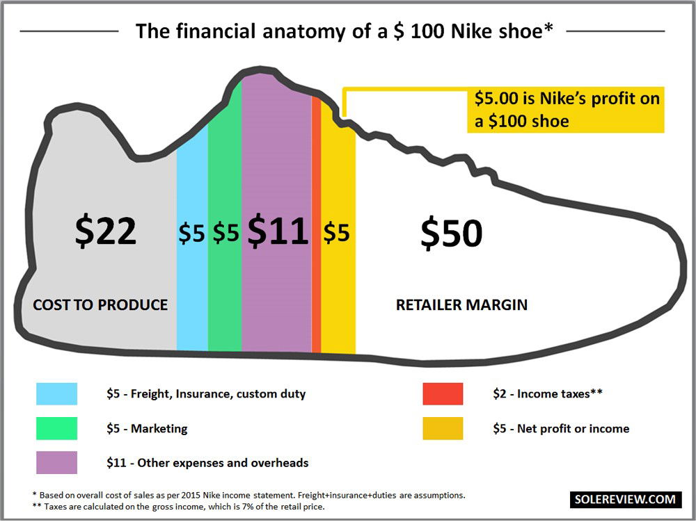
The original graphic explains where every dollar of a $100 shoe goes, ending with a shocking $5 profit. The follow-up heatmap shows how viewers’ attention moves: first to the $50 retailer margin, then to the “$5 profit” callout. The conclusion? Visual hierarchy decides what your brain believes first.
Why It Works
- High contrast draws instant attention
- Round numbers like $100 and $5 feel simple and sticky
- Visual flow moves left to right, like text reading
- Color breaks help chunk info into memorable bites
Examples
- Apple uses white space to guide eyes to the product shot
- McDonald’s menus highlight “value meals” in yellow boxes
- HubSpot infographics use orange highlights to pull focus to key stats
Analyzed by Swipebot
Loading analysis...
