Sumo Pricing
Updated on
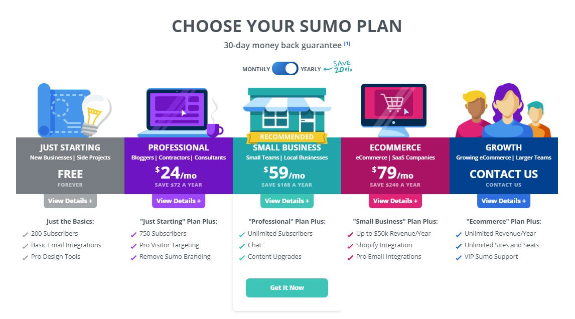
Sumo’s pricing chart isn’t just a price list—it’s a mini comic strip that sells. Each plan has its own cute illustration that instantly clicks with the target user. A glowing bulb for startups. A coffee mug for pros. A storefront for small business. All backed by bright, happy colors.
Why This Works
- Visuals segment users instantly—no reading needed.
- Friendly icons reduce friction and make pricing feel less “salesy.”
- Bright contrasts highlight the recommended plan.
- The toggle (monthly/yearly) adds interactivity and boosts engagement.
- Each label speaks directly to a persona, not just a price point.
Real-World Examples
- Mailchimp uses animal mascots to make pricing friendly.
- Notion highlights its “Most Popular” plan with color and icons.
- Canva’s “Pro” tier pops visually, driving more upgrades.
Analyzed by Swipebot
Loading analysis...
