WeatherTech Liner Magazine Ad
Updated on
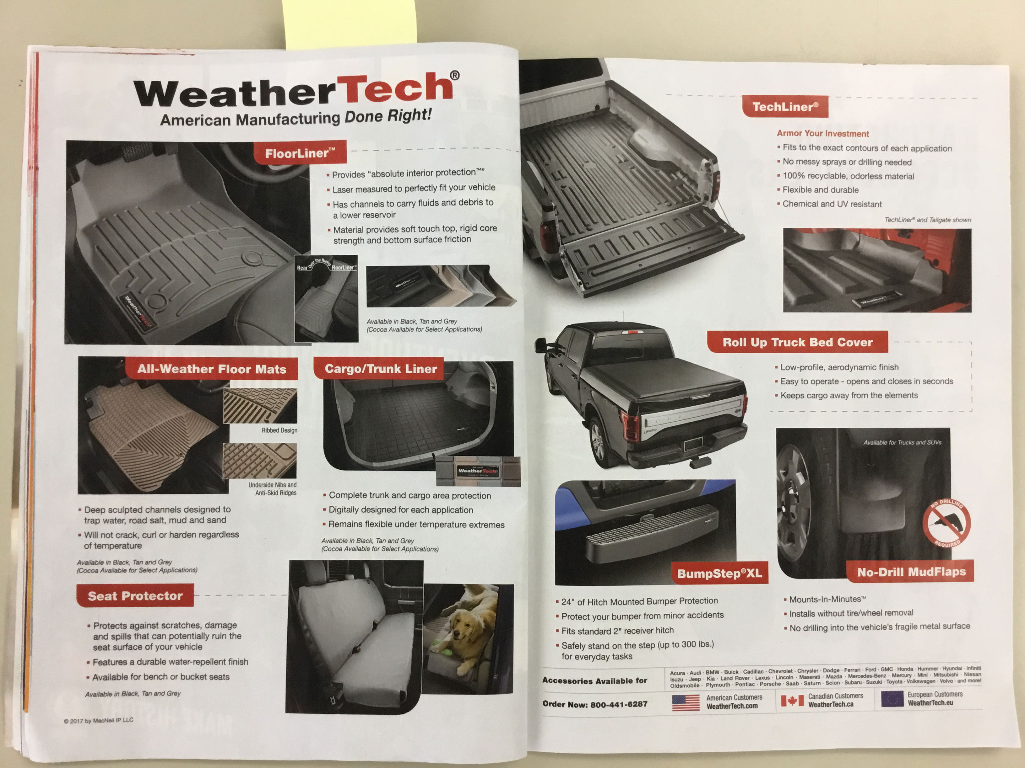
WeatherTech’s magazine spread is a masterclass in making a product catalog feel exciting. It’s not cluttered. Every inch is clear, structured, and selling hard without shouting.
The Design That Sells Quietly
Each product block is its own tiny landing page: big photo, red header, bold name, short bullet points, and proof of it in use. Everything follows the same rhythm, so readers instantly know where to look next.
Why It Works
- Predictable design = instant trust
- Bullets make benefits scannable
- Real photos show real value
- Consistent layout builds brand recall
- Clean hierarchy guides the eye naturally
Real-World Parallels
- Apple uses grids to compare iPads side-by-side
- IKEA catalogs follow this exact pattern
- Dyson ad layouts mirror the same modular flow
- GoPro’s packaging nails this “mini landing page” look
Analyzed by Swipebot
Loading analysis...
