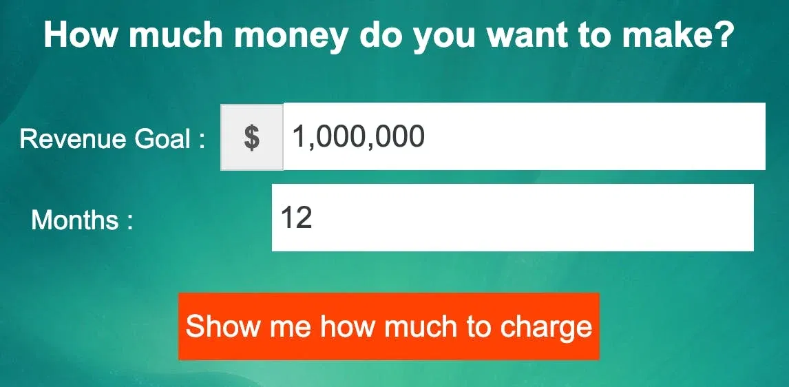
Most people set big revenue goals but forget to do the math. This graphic makes that impossible to ignore. It literally shows how many customers you need at each price point to hit a million bucks.
The Marketing Math Behind It
This chart visualizes your revenue goals the same way gyms sell tiered memberships or SaaS companies offer “Good, Better, Best” pricing. It forces you to think about what you’re selling, who’s buying, and how much they’ll pay.
Why It Works
- Breaks down big, scary goals into doable numbers
- Helps you spot whether you’re priced too low for your goals
- Makes pricing strategy visual and memorable
- Encourages tiering offers to match different buyer budgets
Examples
- Basecamp’s $99/month flat plan uses simple math like this.
- Gumroad shows creators earnings per tier (free, premium).
- Kajabi sells pricing tiers at $149, $199, $399 to align value and volume.
- Apple upsells with base, Pro, and Max models—the same logic in action.
Analyzed by Swipebot
Loading analysis...
