1930's illustration showing aerodynamic engineering of new cars
Updated on
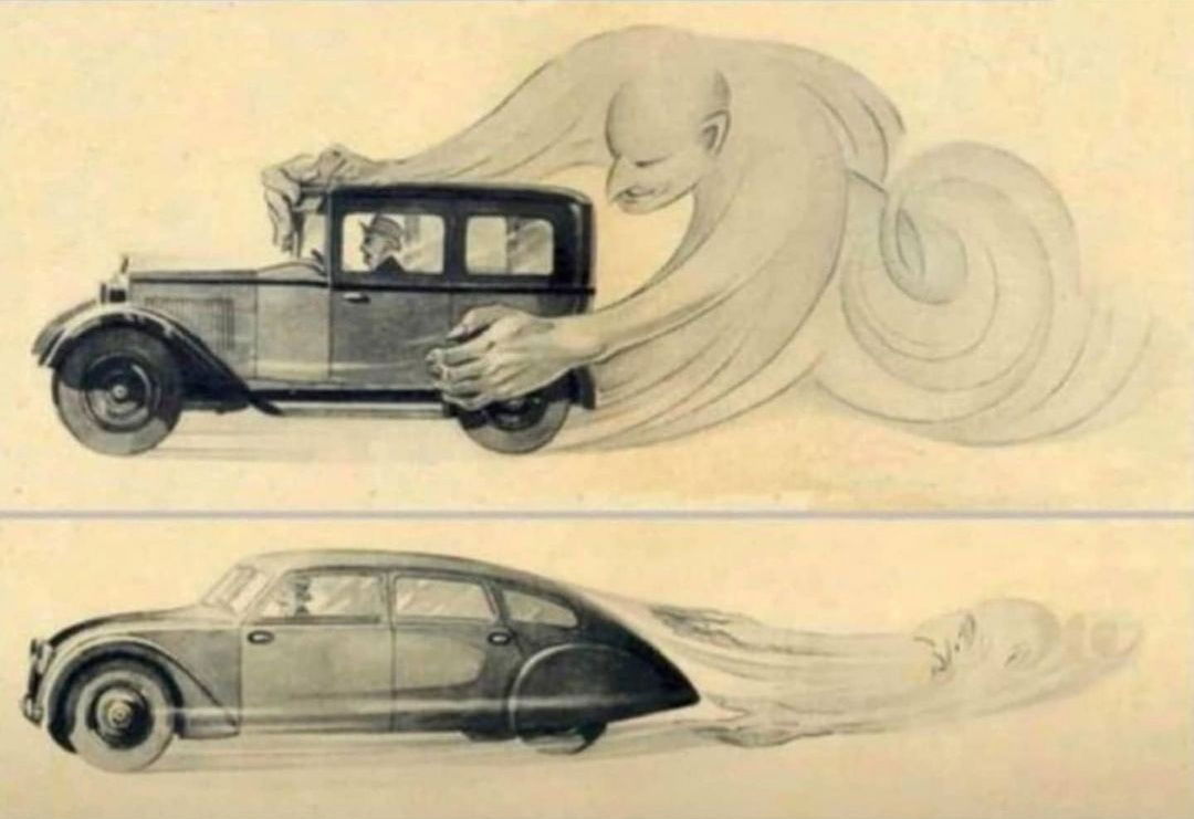
This old-school drawing nails what great marketing does: it shows the value, not just tells it. No words, no data, just a clear and emotional contrast. You instantly get why the bottom car is better.
Why it works
- Translates a complex concept (aerodynamics) into a gut-level visual
- Uses contrast to create instant understanding
- Emotionally personifies the problem (wind drag)
- The storytelling happens in one glance
Real world examples
- Apple shows messy vs. tidy cables to sell AirPods
- Dyson vacuum ads show dirt swirling into clear bins
- Tesla’s visuals compare sleek EVs vs. gas clunkers
- Before-and-after ads for fitness or cleaning mimic this contrast instantly
Analyzed by Swipebot
Loading analysis...
