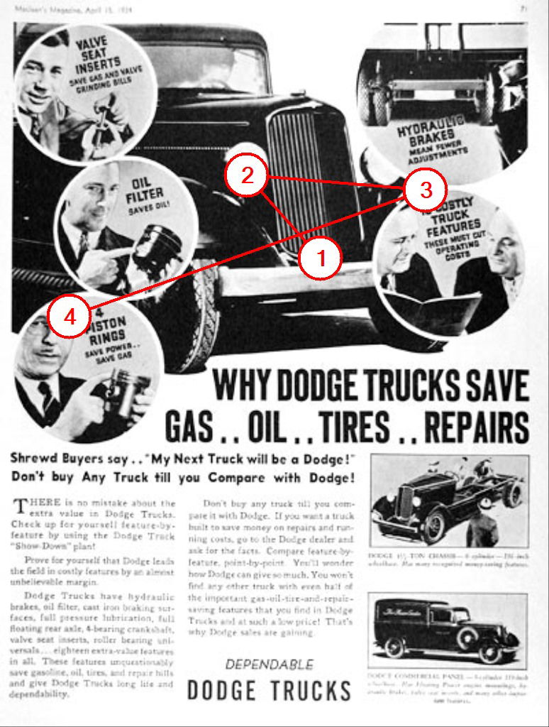
1934 Dodge Truck Print Ad
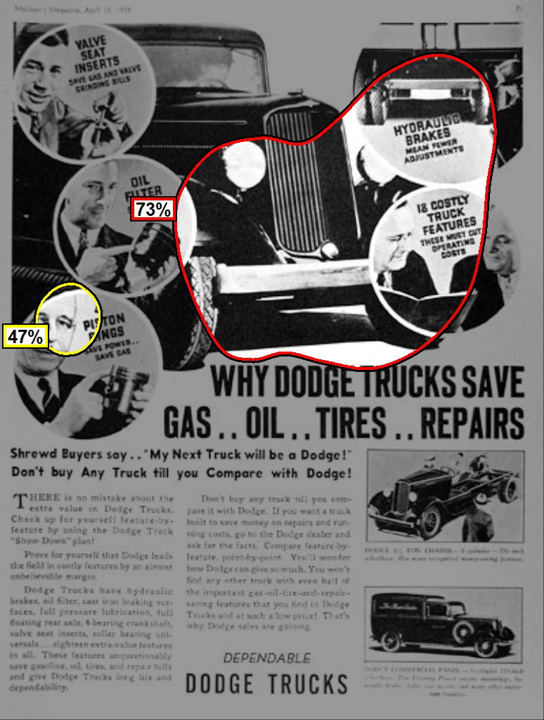
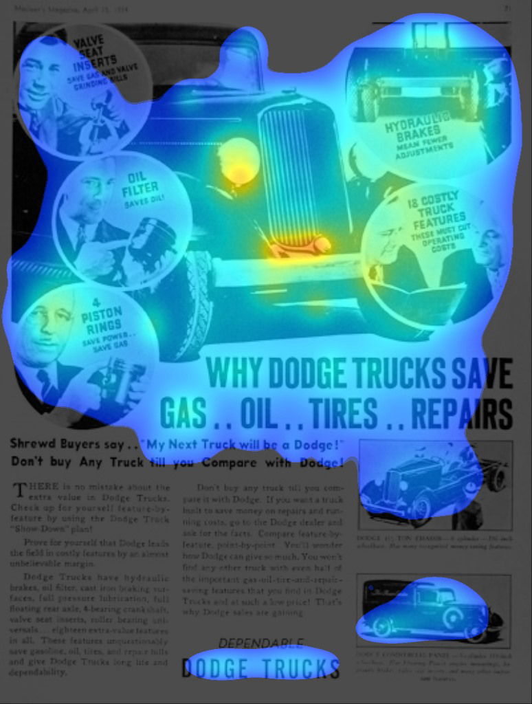 The Regions Report graphically represents the likely distribution of visual attention during preattentive processing.
 Any area or object that is identified as one of the first 4 predicted fixations is highly likely to be noticed at first glance, regardless of its 1, 2, 3, or 4 order.
