1940's Free Nestle's Instant Sweet Milk Cocoa
Updated on
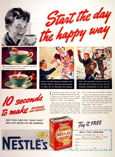
This old-school Nestlé ad shows how to guide attention like a pro. Everything’s intentional—from the red headline to the smiling faces to the “Try it FREE” kicker at the bottom. It’s basically a masterclass in visual flow before anyone used words like “UI” or “conversion funnel.”
Marketing analysis
Your eyes start at the bold headline, slide to the beaming mom, drop to the steaming cup, then finish on the coupon. That’s a perfect attention ladder: interest, trust, desire, action.
Why it works
- Red headline grabs you instantly
- Happy faces build comfort
- Clean visual hierarchy keeps focus tight
- “Free” lowers friction to act
Examples
- Coca-Cola paints shelves red for the same attention hit
- Apple ads guide your gaze toward sleek CTAs
- McDonald’s pairs warmth and color for instant approachability
Analyzed by Swipebot
Loading analysis...
